Self-Sufficiency Standard - Montgomery County, MD
Critique by Gautam Kushwah for CS424 Spring 2022
Link to the original visualization
What is Self-Sufficiency Standard?
Intuitively, self-sufficiency standard to me sounded like a yardstick to measure the ability of someone to be able to live independently without needing help from others.
Formally for this tool, the Self-Sufficiency Standard is defined as follows
A project of the Center for Women’s Welfare (CWW), the Self-Sufficiency Standard(SSS) is a budget-based, living wage measure that defines the real cost of living for working families at a minimally adequate level. The Standard is an affordability measure and an alternative to the official poverty measure.
The Self-Sufficiency Standard determines the amount of income required for working families to meet basic needs at a minimally adequate level, taking into account family composition, ages of children, and geographic differences in costs.
Purpose of the tool
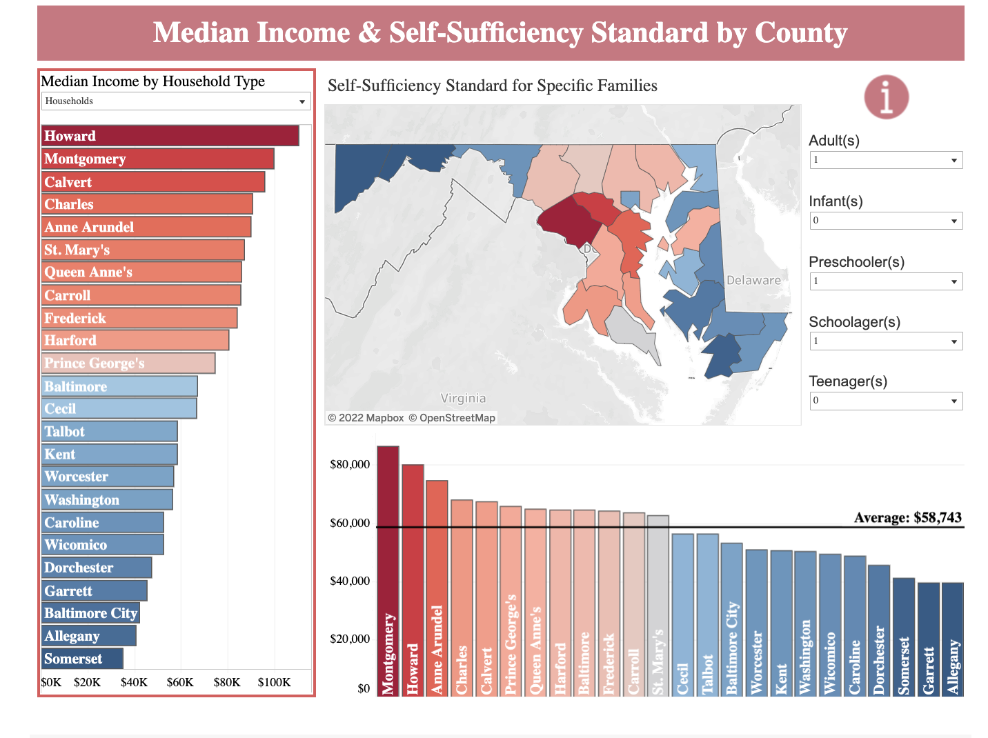
This dynamic tool strengthens our common understanding of the challenges the working residents of Montgomery County face. The user can apply various filters filters to census data to reflect specific geographic and household information for a given family type. The resulting Self-Sufficiency Standard defined the earning needed to establish economic stability. Additional graphs depict census information about residents living below the self-sufficiency.
The Self-Sufficiency Standard is especially useful in an area like Montgomery County where median income and poverty rates can be misleading. While Montgomery County is considered a very wealthy county, the high cost of living results in many residents struggling to pay for basic necessities.
What is the data?
The tool uses data such as
Occupational Employment and Wage Statistics The minimum wage in Montgomery County Poverty guidelines based on the number of people in the household U.S census bureau - American Community survey 5-year estimates , which included a wide range of sociodemographics features
To calculate the the self-sufficiency standard which the CWW thinks is a better measure than poverty guidelines given by the Office of the Assistant Secretary for planning and Evaluation (ASPE)
How was the data collected?
The tool relies on the data collected by the US government. Census data is collected at regular intervals using methodologies such as total counts, sample surveys, and administrative records. After it is collected or generated, census data is summarized to represent counts or estimates of groups of people for different geographic areas
Userbase
The Standard is a tool that can be used in a variety of ways-by clients of workforce and training programs seeking paths to self-sufficiency,by program managers to evaluate program effectiveness, and by policymakers and legislators seeking to create programs and pathways that lead to self-sufficiency for working families.
Questions to ask
The tool helps us visualize the difference between the federal poverty line and the self-sufficiency standard.
It also helps us understand that the amount a person will make on minimum wage is much lower than the self-sufficiency standard.
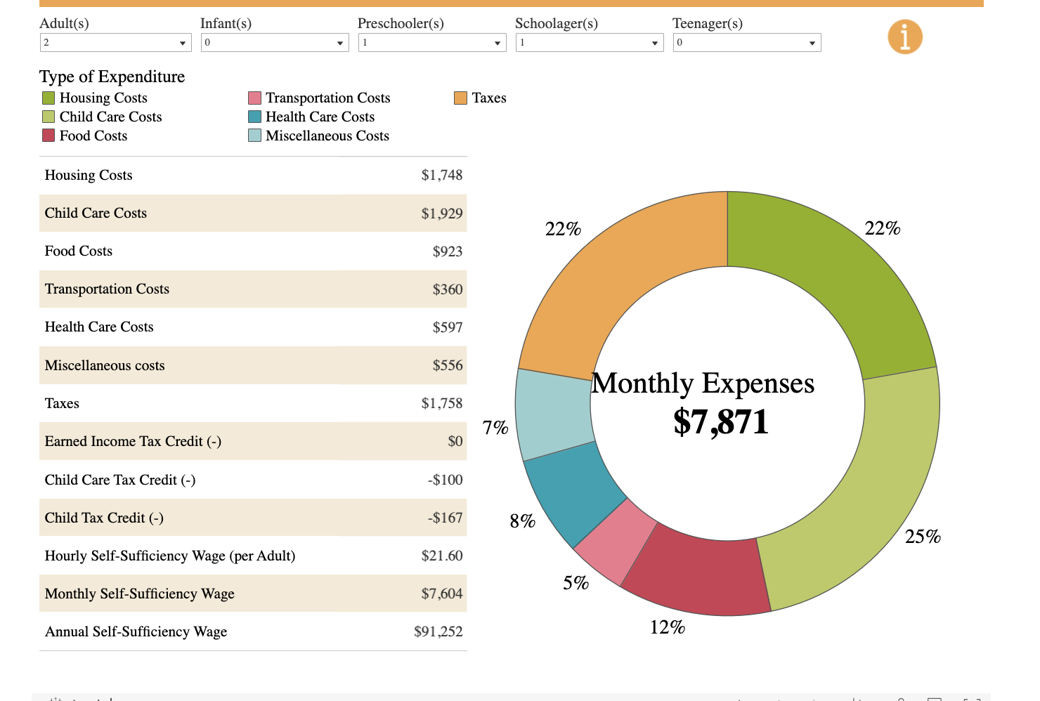
It also gives a breakdown of all the household expenditures by category for a particular family.
So the questions that people really want to ask are:
- how much does a household need to earn to be able to live comfortably, meeting all their basic needs and requirements based on the type of family and the geographic location?
- How does this vary across different counties?
- What components does the SSS have?
- What is the difference(in USD) between the SSS and median household income?
- What part of the population lives below the SSS?
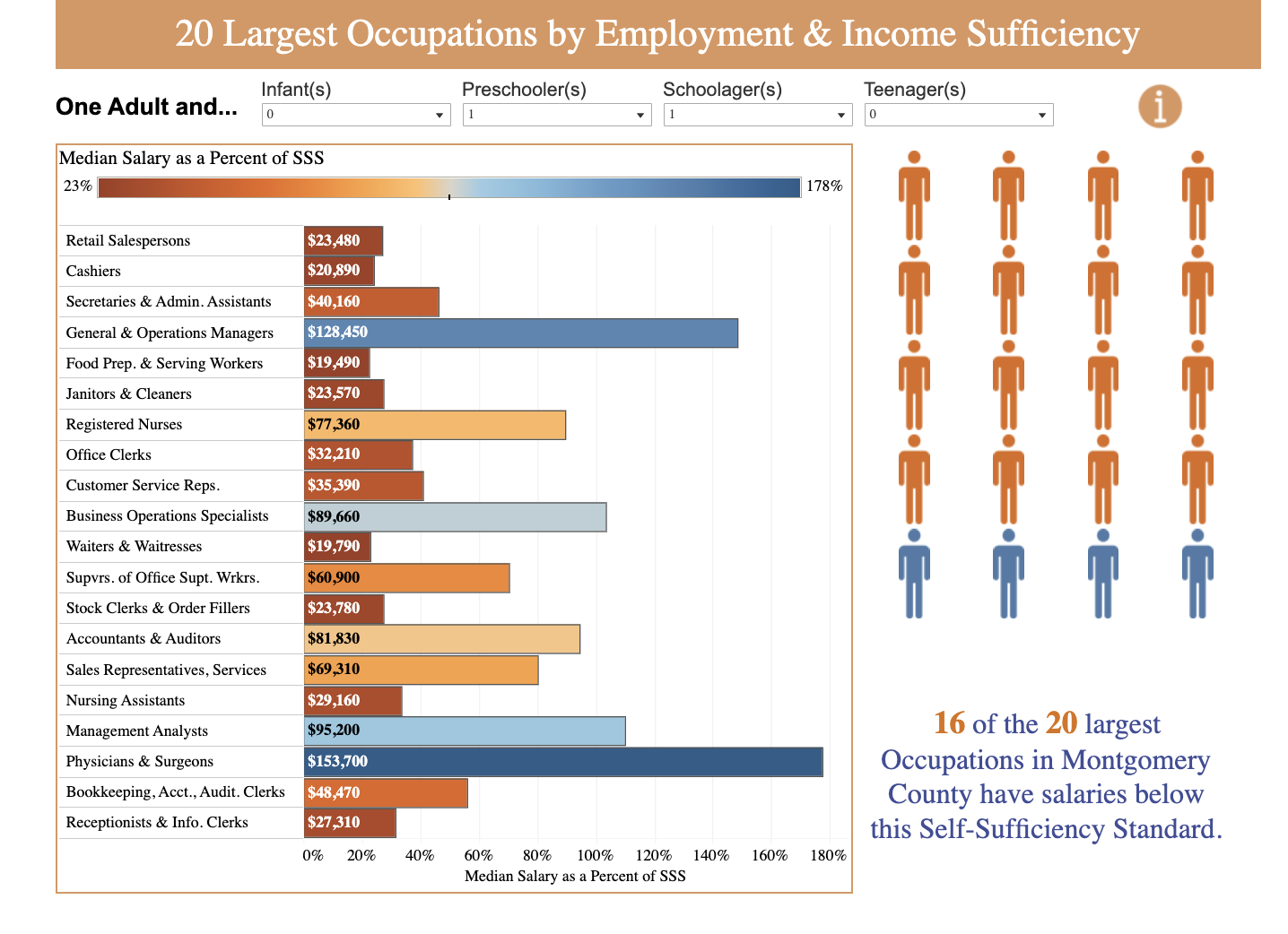
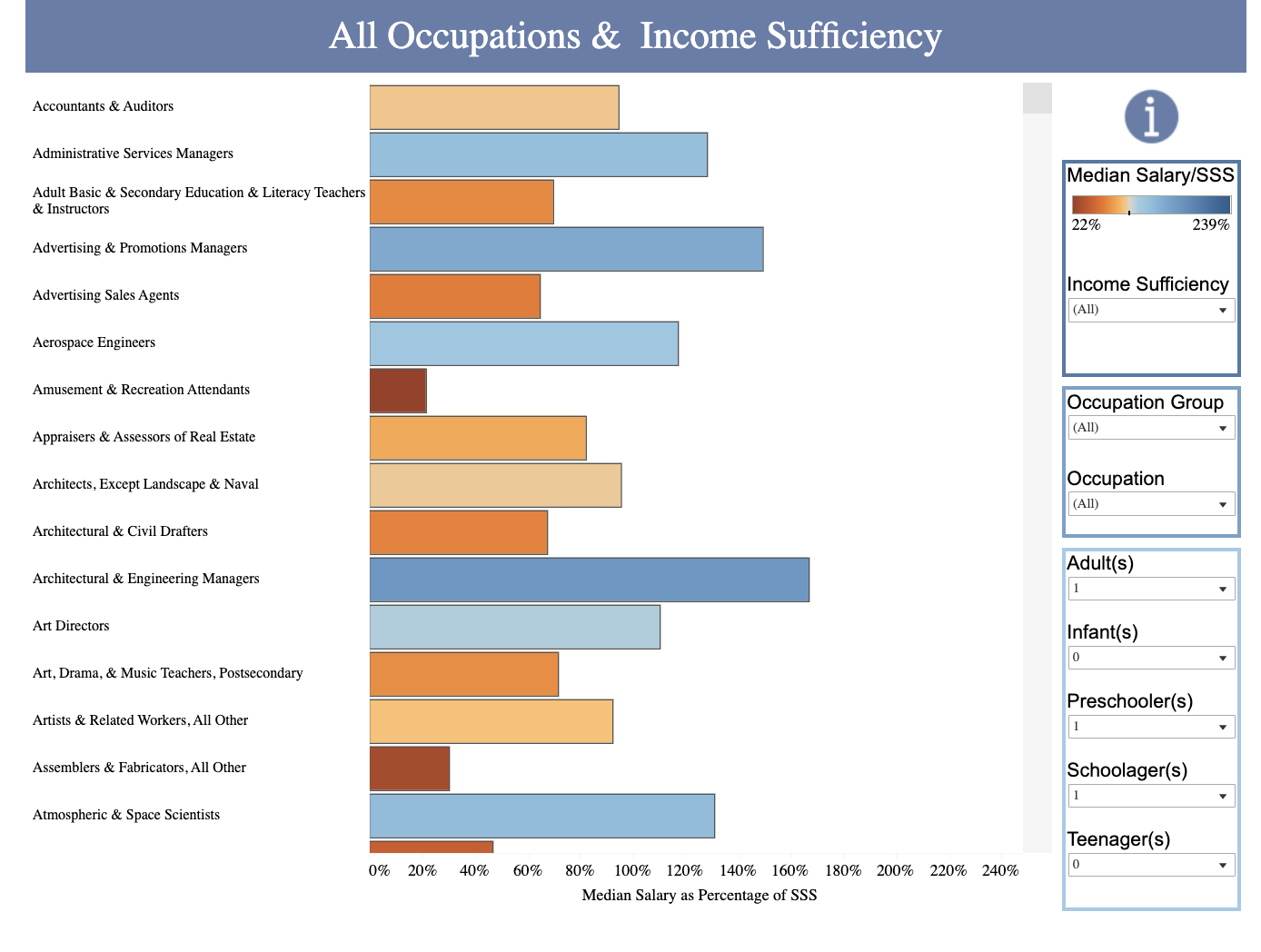
- Which jobs offer the best salaries compared to the SSS?
How to find answers to these questions
The tools offers various type of visualization to help the user answer these questions.

There is a naviation bar on top of the tool which the user can use to navigate between different visualisations.
The visualisation include bar graphs, pie charts, choropleth maps, dot charts etc.
The user can tweak the inputs to the visualization as per their requirement.
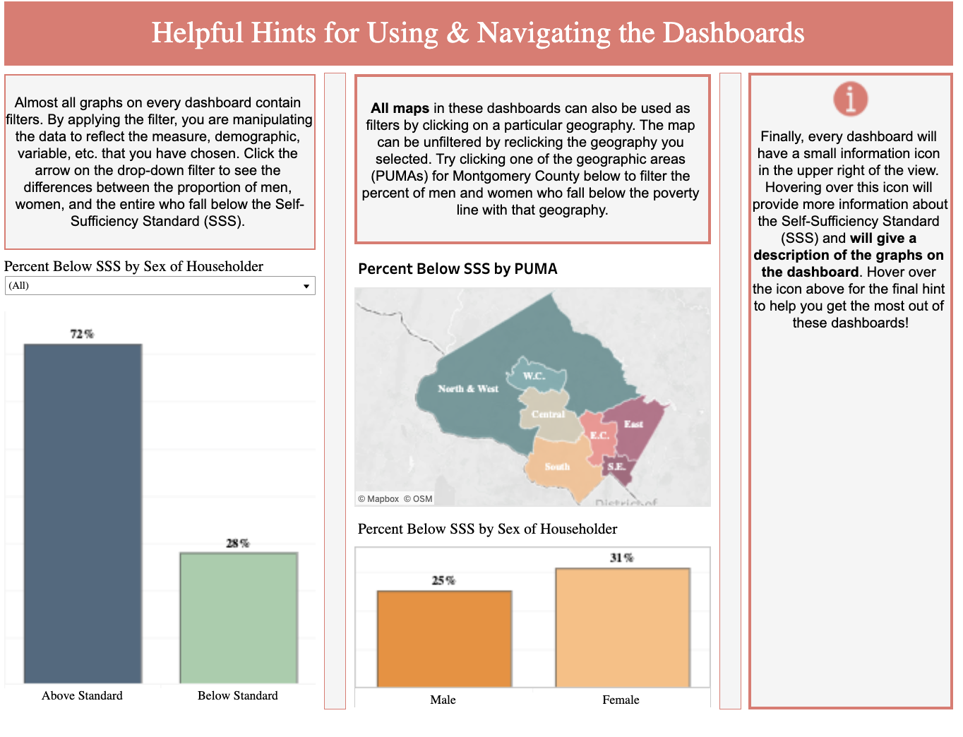
Some visualizations also have a map of the counties which are color coded to aid the user to quickly select that county and see the associated information.
Furthermore, all visualizations also have an “info” button on the top right which the user can utilize to better understand the visualization.
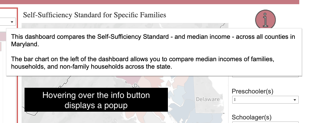
The tool has a page dedicated to this
What works? 
The Good
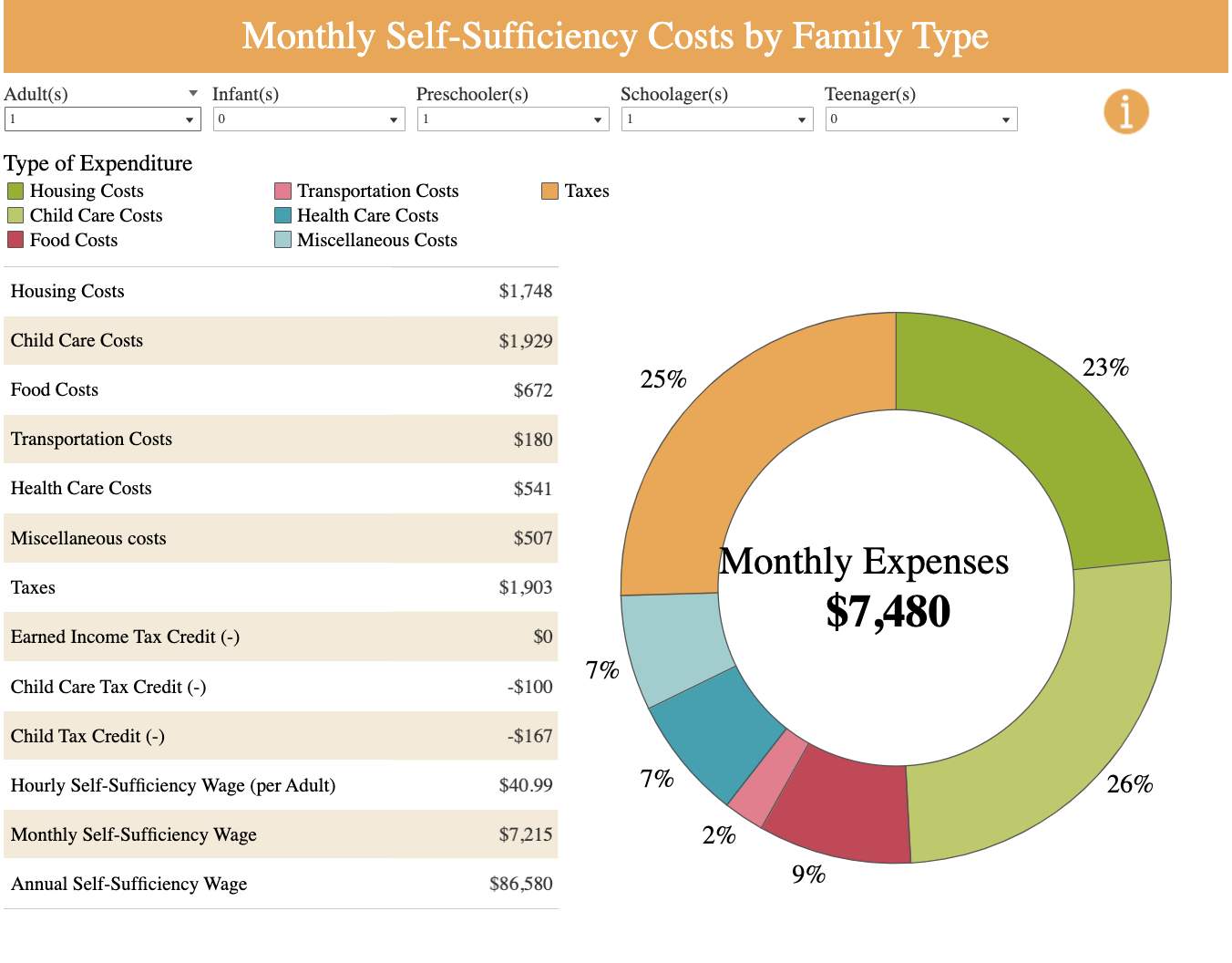
- The pie helps the user understand how much the that component contributes to the whole
- Whereas the table helps the user see the exact amount a particular component has.
- The table also has rows for annual and hourly wages according to SSS
- All the user inputs are clearly labelled
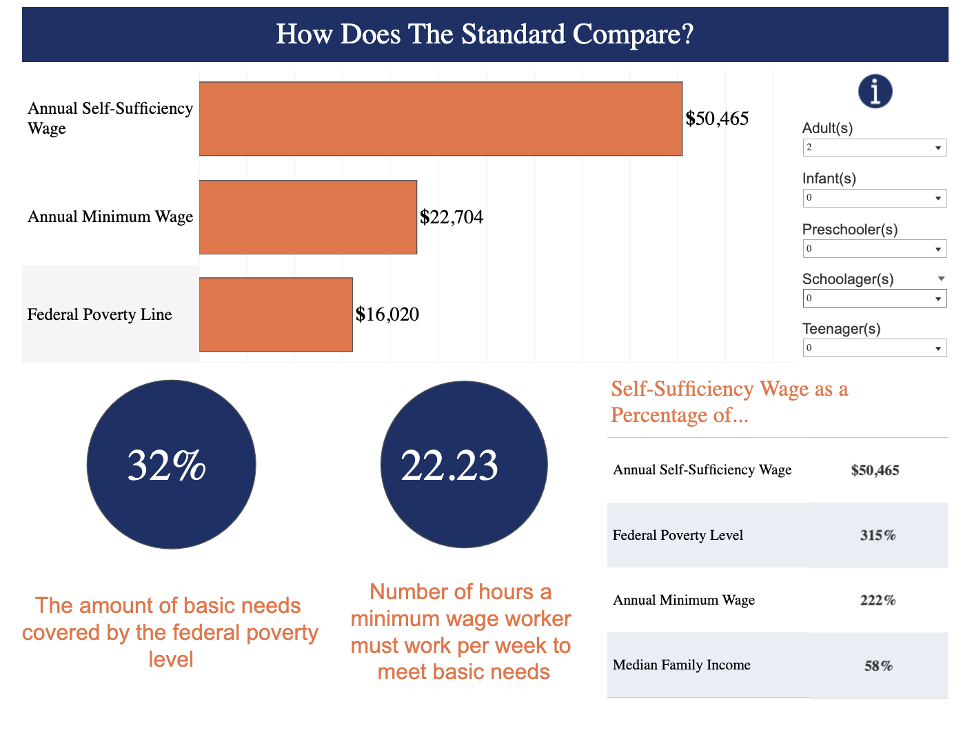
- The tool gives us some interesting insights as to how the SSS compares to the Minimum wage and and how much would that cover the basic needs of an individual.
- The insights are interative and change dynamically with the input
- It gives the user context about how much hours would an adult have to put to make money on mininmum wage to meet bare essentials
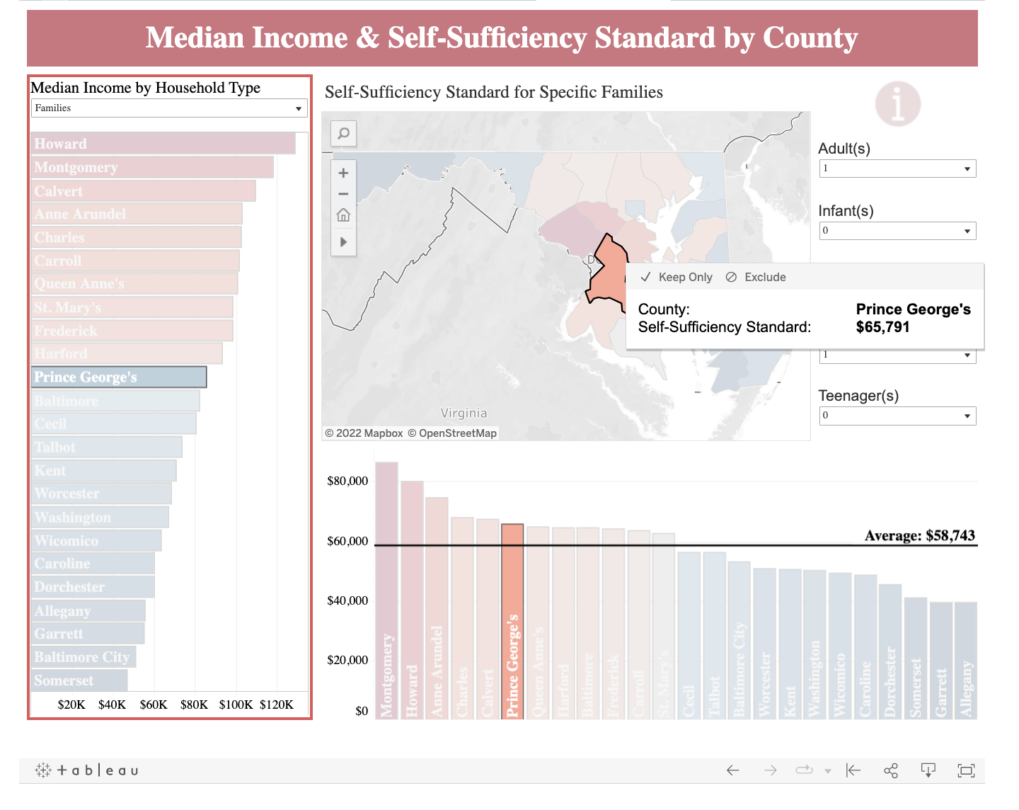
- Clicking on a particular county on the map highlights the data on other visualisations
- Map is pannable, zoomable and resetable
- Good color scheme
- Reference line for average SSS helps the user quickly compare the SSS for a particular county against a baseline
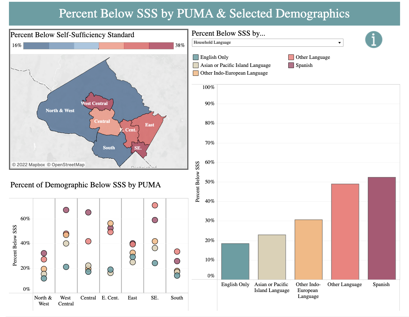
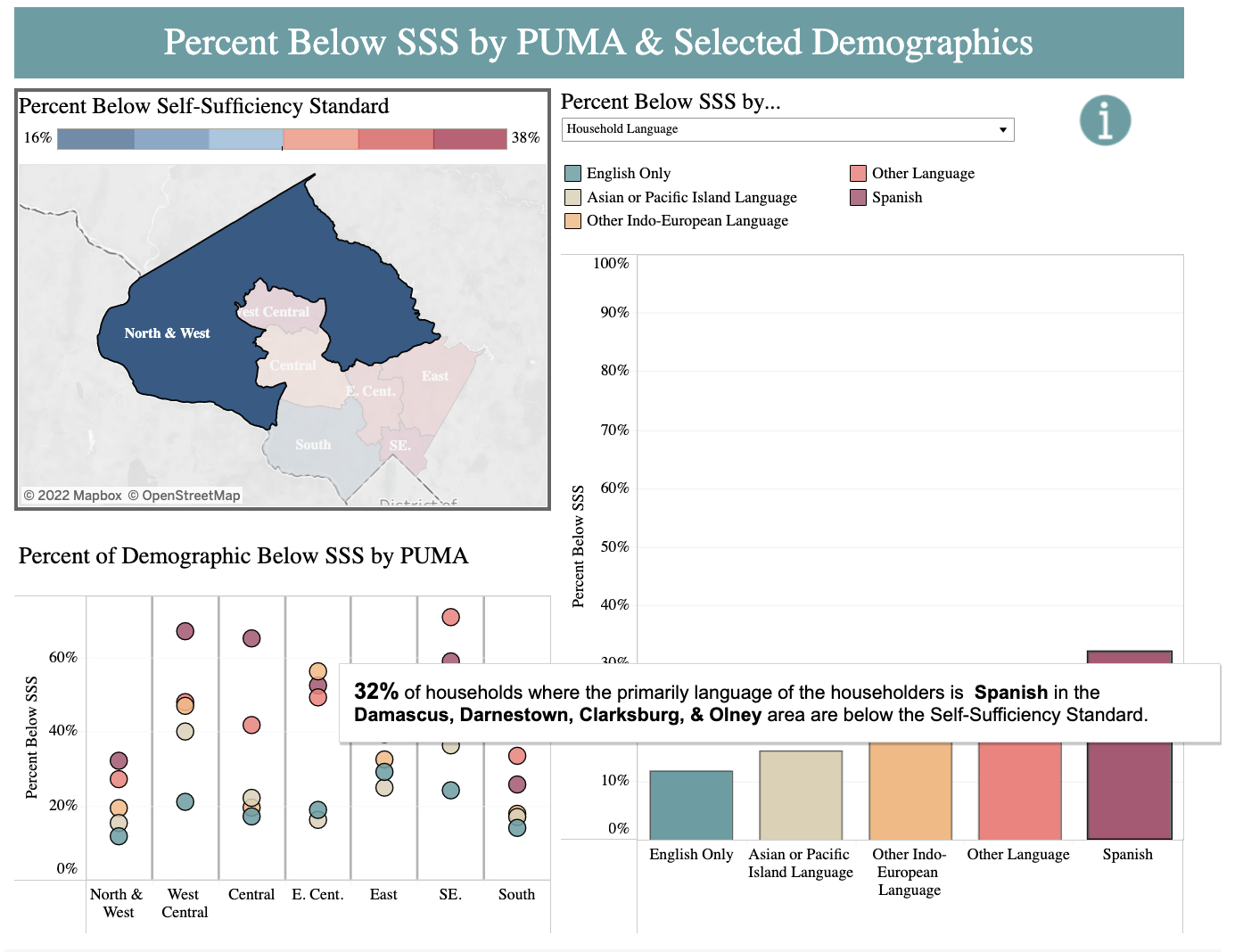
- The barplot on the right initially displays the data for the whole county in an aggregated manner but clicking in the map changes the barplot to display data for that area/PUMA Public Use Microdata Areas (PUMAs) are non-overlapping, statistical geographic areas that partition each state or equivalent entity into geographic areas
- Good use of popups: On hovering over the bar plot the popup shows all the areas covered in that PUMA
- The dot chart gives us an overall picture of all the PUMAs and how the data is distributed amongst them
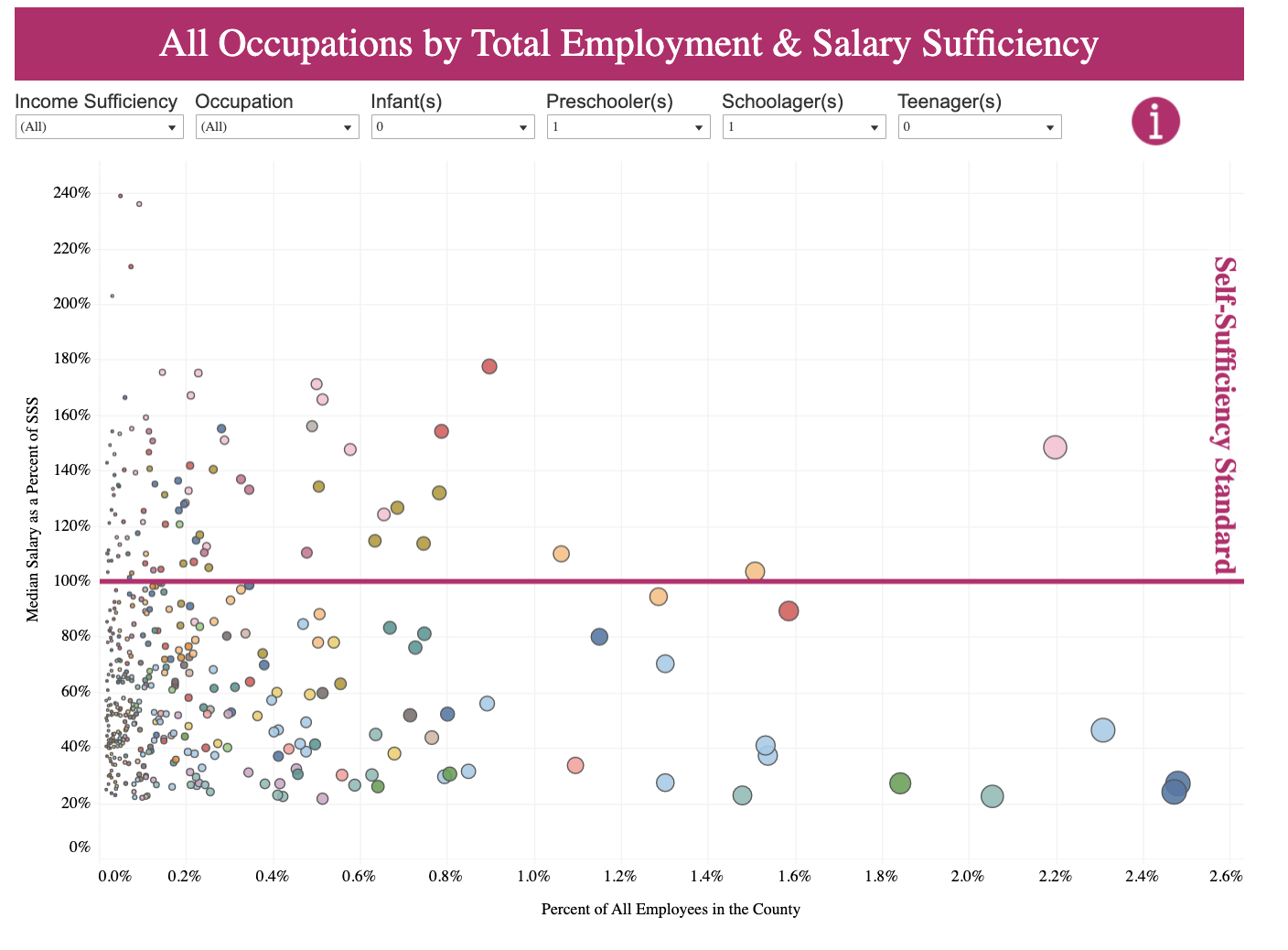
- Good use of size as a measure of data. The diameter of the dots correspond to the percentage of the employees in that occupation which constitute the the total workforce in the county
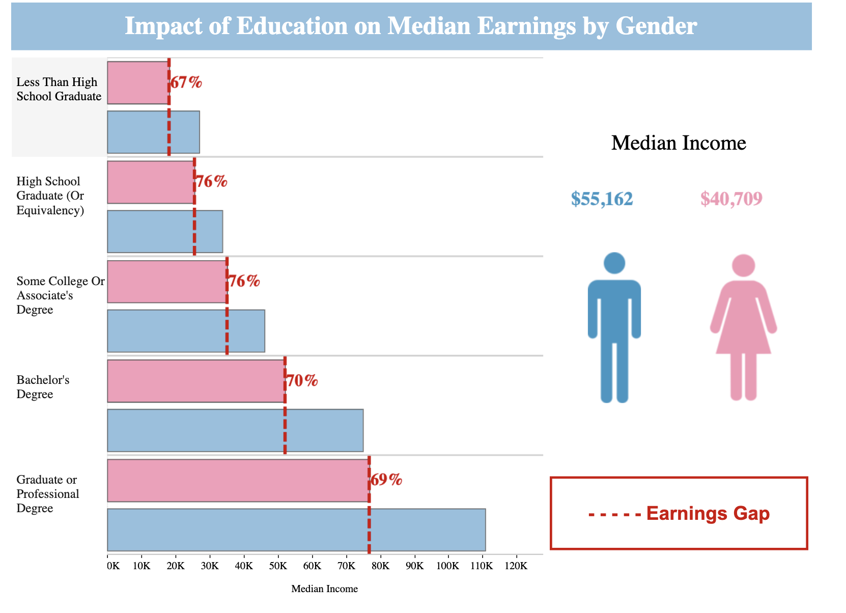
- This visualisation clearly communicates the income based on education and the gender pay gap.
- Good use of icons for different categories which also serves as a legend
- Hovering over the bar gives the exact reading for income thus making it easier to read the chart.
Needs improvement?
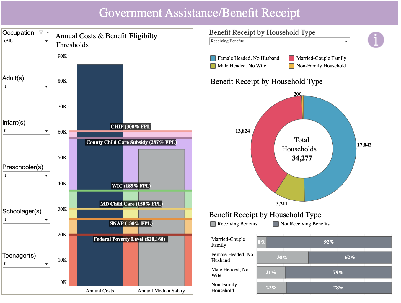
- Instead of using shaded regions on the bar plot, there should have been reference lines only to avoid visual overload
- Labels for the shaded regions could’ve been on the right hand side of the graph to avoid crowding and confusion
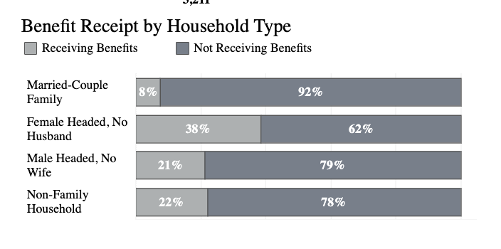
- A better color scheme could have been used, preferably with high contrast to represent the two categories
- No clear option to sort the bar plots
- This is consistent throughout the tool
- The placement of the plot and the legend could have been more aligned
- The colors for unrelated categories are very close to each other in hue
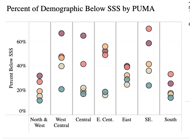
- The chart is too small to be able to see overlapping dots. There should be an option to zoom in.
Other Improvements
- There could be an option to change color schemes for people who have trouble perceiving different colors