CS 424 - Project Page - Big Yellow Taxi
maintained by
Gautam Kushwah & Krishnan C.S.
Important Links
Link to Shiny App for Project 3
Resources
Introduction
This app was built as part of CS 424 - Visualization and Visual Analytics Course under Dr. Andrew Johnson in Spring 2022. The app is written in R and hosted on the evl(electronic visualization laboratory) shiny app server. This app visualizes data on Taxi rides in and outside Chicago in multiple ways using R, Shiny, leaflet and Shiny Dashboard to help the user get a better understanding of the data and make inferences.
The app is made to be served on a large screen size (11,520 X 3, 240 pixels). Therefore viewing it on a smaller screen would lead to the layout breaking up. A simple solution is to emulate a large screen size using chrome or some other browser.
Software version
R version 4.1.2 (2021-11-01) – “Bird Hippie”
RStudio 2021.09.1+372 “Ghost Orchid” Release (8b9ced188245155642d024aa3630363df611088a, 2021-11-08) for macOS Mozilla/5.0 (Macintosh; Intel Mac OS X 12_2_1) AppleWebKit/537.36 (KHTML, like Gecko) QtWebEngine/5.12.10 Chrome/69.0.3497.128 Safari/537.36
What is R?
R is a programming language for statistical computing and graphics supported by the R Core Team and the R Foundation for Statistical Computing
What is Shiny?
Shiny is an R package that makes it easy to build interactive web apps straight from R. You can host standalone apps on a webpage or embed them in R Markdown documents or build dashboards
Purpose of this App
The purpose of this app is to use the data provided on Taxi rides in and outside Chicago in 2019 and use shiny to give people an interactive interface to create those visualizations. Since the 2019 data is pre-COVID it is more representative of a ‘typical’ year.
The data is presented in various ways, in the form of a map, a heatmap, bar plots and also in the form of tables with controls for each of them.
The app provides various data visualizations in the form of bar graphs breaking down rides in and outside chicago across days, months, and days of the week and by the starting hour. It also includes plots for percentage of rides to/from each community, and taxi company.
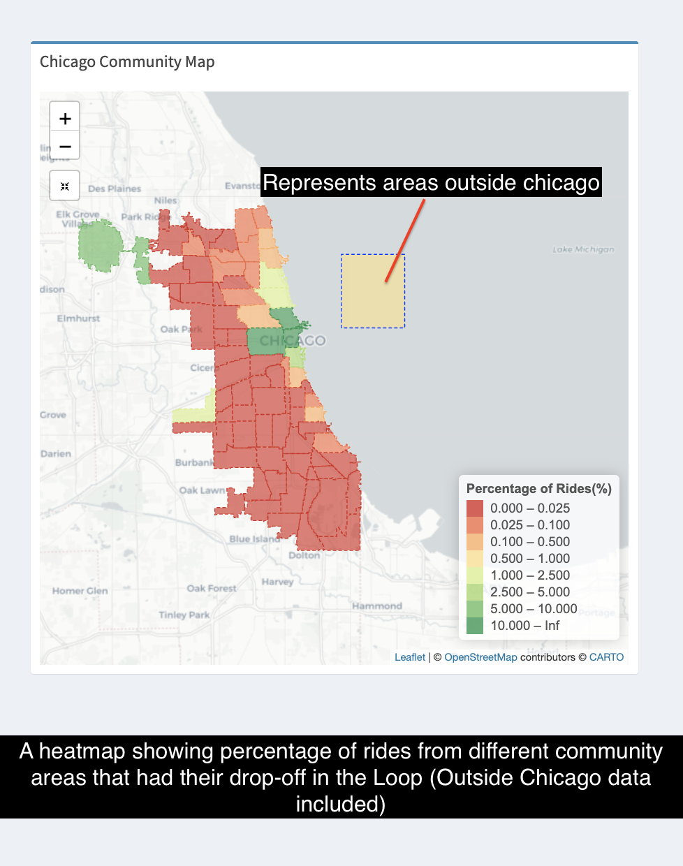
The user can choose to view the data in km/miles, the hour in 24/12hr formats, and to/from community area. There are also options for the user to select a community area and taxi company. The user may choose to include rides outside chicago as well. There is also a map of Chicago community areas using which the user may select the community area to view a heatmap showing the percentage of rides to/from the community. The user may also select taxi company to subset this heatmap, showing percentage of rides to/from that community by that taxi company only.
The app could also help the user find interesting things about the data which might have affected the behavior of the taxi rides and thus help us understand the power of data and data visualization.
How to use the App?
You can head over to the app here. Upon opening the app, you would be greeted with a Shiny dashboard which would give you a map of chicago communities with their boundaries marked, bar plots for the toal number of rides, and those rides filtered through hourly entries, entries for day of the week, month, mileage and trip time.
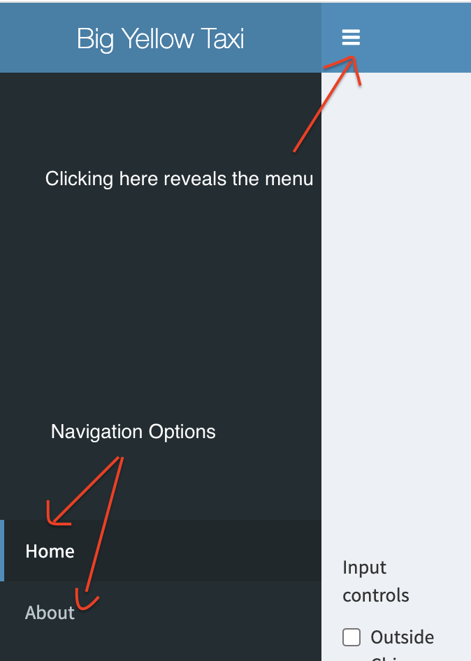
The app has two sections
- Home Page
- About Page
These sections could be navigated through using the navigation bar on the left.
Home Page
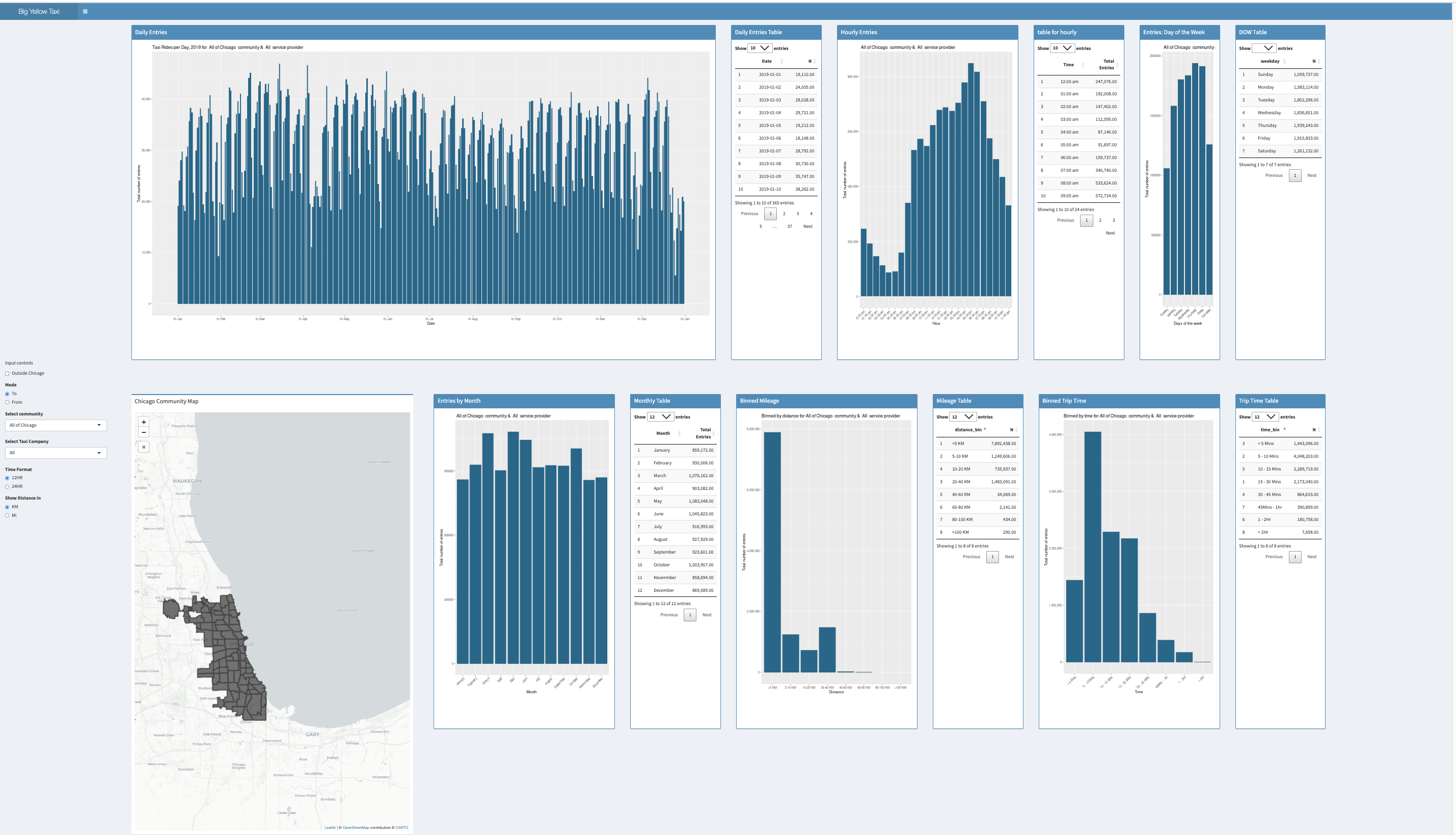
The home page has all the controls for the visualisations shown i.e the map with community areas locations and their data, in a separate section marked input controls.
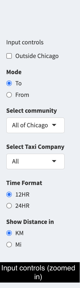
There are 7 input controls
- Outside Chicago checkbox: A checkmark to decide whether or not to include data for trips ending or beginning outside chicago
- Mode: A radio button to select whether the ride ends or originates from a selected community
- Select Community: A dropdown list of all the chicago community areas. Includes “Outside Chicago” if the Outside Chicago checkbox is checked
- Select Taxi Company: A dropdown list of all the taxi companies included in the dataset
- Time Format: To select whether to view the time in 12hr or 24hr format on the visualisations
- Show Distance in: To select whether to show distance in km or miles on the visualisation
- Chicago Community Map: The map itslef can be used an input to select the community areas.
The app has 8 visualisations
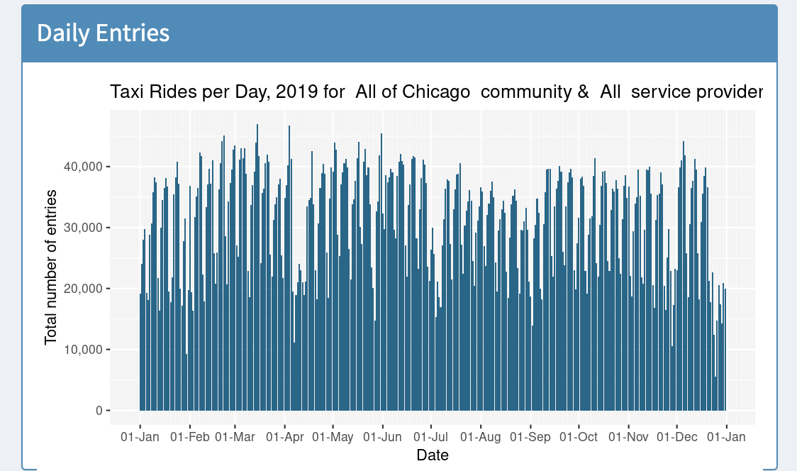
1.Bar chart for all the entries across the year
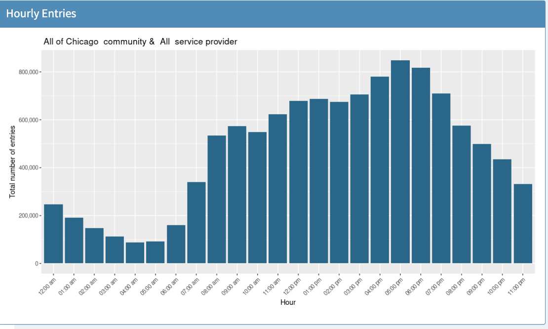
2. Bar chart for rides binned by hour of the day
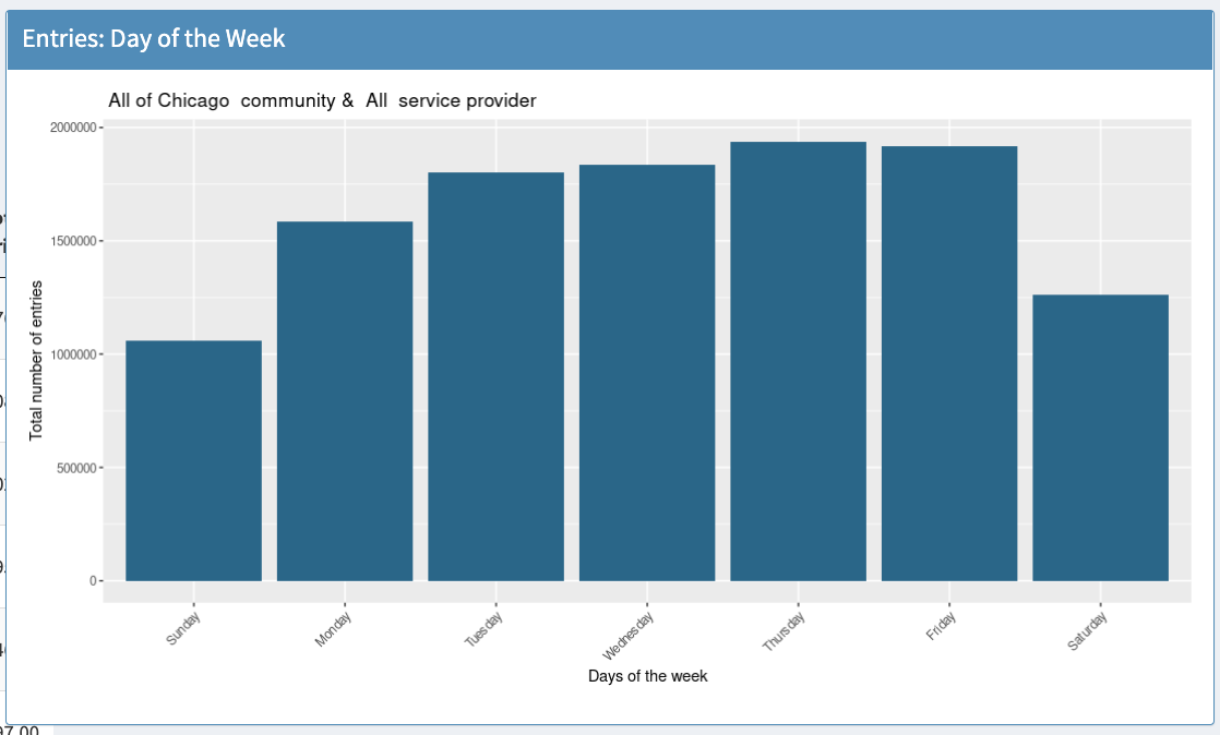
3. Bar chart for rides binned by day of the week
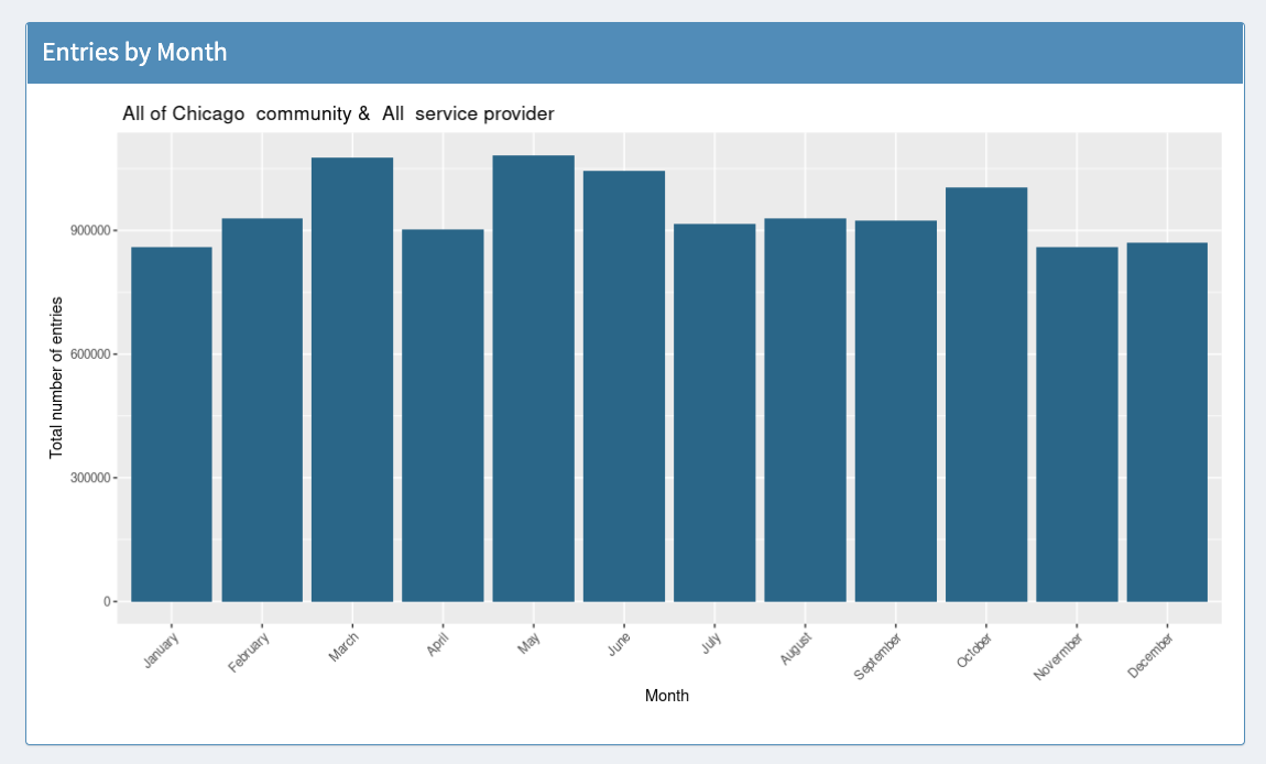
4. Bar chart for rides binned by month
5. Bar chart for rides binned by mileage

6. Bar chart for rides binned by trip time
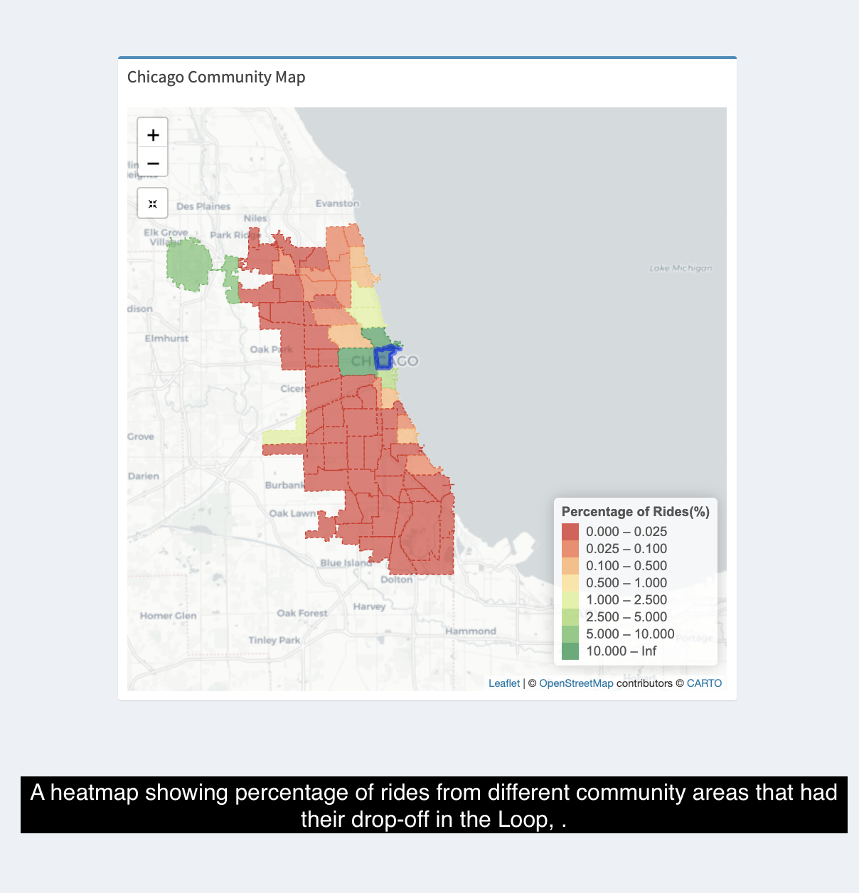
7. Heatmap for percentage of rides ending or starting in a community
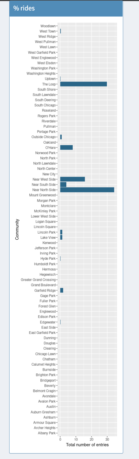
8. Bar plot for percentage of rides ending or starting in a community
All of these visualisations, except 7 and 8, could also be viewed in the form of a table.
About the Data
The trip data was obtained from Chicago Data portal, the link to the data could be found here
This list shows data about taxi trips reported during the year 2019. There are total of 23 coulmns and 16.5 million rows, where each row represents a trip.
For this app we have taken a subset of the data using 5 columns
The columns are as follows
Trip Start Timestamp - When the trip started, rounded to the nearest 15 minutes.
Trip Seconds - Time of the trip in seconds
Trip Miles - Distance of the trip in miles
Pickup Community Area - The Community Area where the trip began. This column will be blank for locations outside Chicago. Integer value representing a community
Drop-off community Area - The Community Area where the trip ended. This column will be blank for locations outside Chicago. Integer value representing a community
Company - The taxi company
The map data was also taken from the Chicago Data portal and tge link could be found here
The data was provided in the form of a shapefile which was read with the help of an R library called rgdal.
R Libraries required to process the data
library(lubridate)
library(ggplot2)
library(leaflet)
library(leaflet.extras)
library(dplyr)
library(scales)
library(shiny)
library(shinyjs)
library(shinydashboard)
library(data.table)
library(purrr)
library(rgdal)
library(RColorBrewer)
library(DT)
library(pryr)
The date was provided in a chr format, therefore it had to be converted into a usable format which was achieved through a R library called lubridate
The data was downloaded in csv format, since GitHub has a file size limit of 100 MB and prefers files less than 50MB, we used RStudio script to break it down into smaller files using the following command
#Readin the file
taxi <- read.table(file = "Taxi_Trips_-_2019.tsv", sep = "\t", header = TRUE, quote = "\"")

#Retaining only necessary columns and removing unwanted ones
taxi <- select(taxi, Trip.Start.Timestamp, Trip.Seconds, Trip.Miles, Pickup.Community.Area, Dropoff.Community.Area, Company )


#Removing trips less than 0.5 and more than 100 miles and less than 60 seconds, and greater than 5 hours,
taxi <- subset(taxi,  Trip.Miles >= 0.5 & Trip.Miles <= 100 & Trip.Seconds >= 60 & Trip.Seconds <= 18000 )

#Splitting data file into smaller chunks
no_of_chunks <- 15
split_vector <- ceiling(1: nrow(taxi)/nrow(taxi) * no_of_chunks)
res <- split(taxi, split_vector)
map2(res, paste0("part_", names(res), ".csv"), write.csv, row.names=FALSE)
We then used a code editor to verify if the files were broken down correctly, and upon verifying that we loaded the filenames in a list in R and then stitched them together into a single table, hence being able to work with all the rows, using the code below
#Reading from the split csv files

taxi_original <- do.call(rbind, lapply(list.files(pattern = "*.csv"), fread))
We then read the map data using rgdal
community_shp <- rgdal::readOGR("shp_files/geo_export_fca70ba1-774b-4562-b299-3cbfe3855c4d.shp",
                                layer = "geo_export_fca70ba1-774b-4562-b299-3cbfe3855c4d", GDAL1_integer64_policy = TRUE)
Next step was mapping the data onto the map for which we used the library Leaflet
The basic syntax is below and a more detailed one could be viewed on the github repo the link for which has been provided above
map <- leaflet(options= leafletOptions()) %>%
      addTiles(group="Base") %>%
      addCircleMarkers(data = df, lat = ~lat, lng = ~long, )
The code for plotting various tables and bar graphs could also be found there
Github
The github repo for the source code could be found below Github Repo CS424
The source code is the file called app.R, with all the broken up csv files named from part_1.csv to part_15.tsv and also the location data file.
The file used to preprocess the data is called preprocessing.R
To run the code you would need to download and install R and R-Studio the links to which could be found !here and here respectively
Either clone or download the zip file from the repo and unzip it on your machine in your preferred location. Now to run the app follow these steps:
1 Open R-studio
2 Click on File->New Project
3 Choose existing directory from the pop-up window
4 Now select the directory where you have downloaded the project
5 Follow the on screen instruction
Once the project has been created/opened go to app.R from the navigation tab on the bottom right of the IDE Then in the file editor window on the top left, you would find a run app button, alternatively you could also use the R console and type in the command “runApp()”
The app would be launched in a separate window.
You could also open it in your web-browser by clicking on “open in web browser” button in the app window
To refer to the instructions on how to use and interact with app, please read the How to Use the App section above
Observation and Inferences
Interesting Inferences - Chicago Taxi Rides and Airports
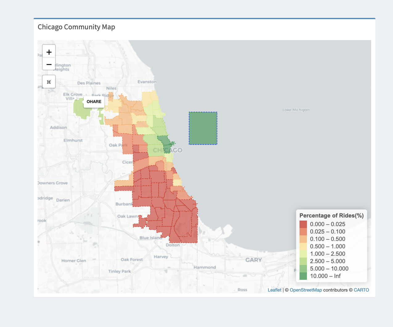
1. If you the see map for rides from O’Hare for all taxi companies, we can see that most of the rides (>10%) were to the Loop and Outside Chicago, followed by communities in the north of Chicago. We can infer that people living far away(Below the Loop) from O’Hare are more likely to not take a taxi, possibly due to high taxi fares than the people living near O’Hare.
2. It is also evident that people come to O’Hare to not just go to Chicago but also to go to places outside it as shown below.
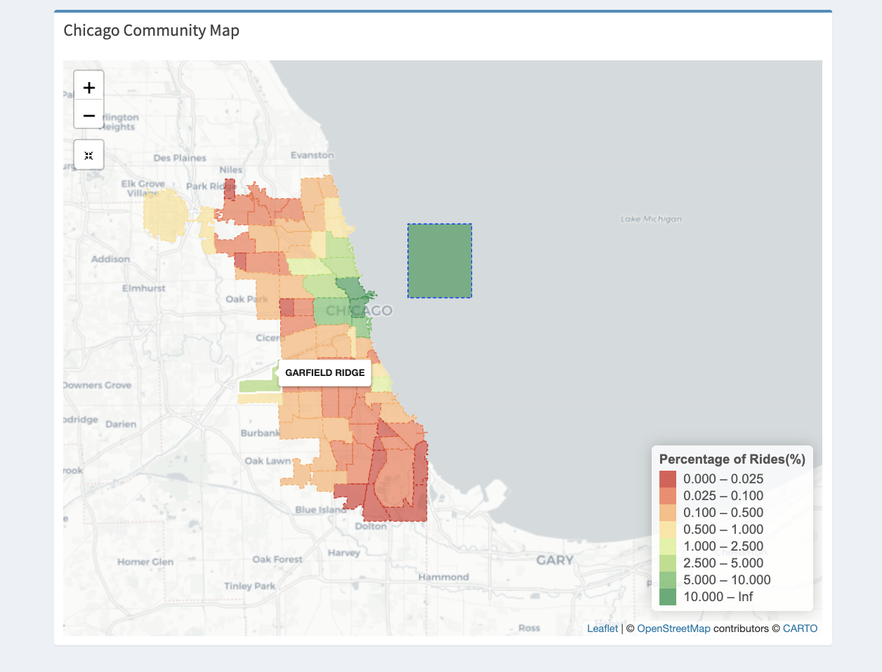
3. Likewise for rides from Garfield Ridge where Midway International airport is located, we can observe a similar trend for all taxi companies where most rides to, are outside chicago and the Loop and its adjoining communities.
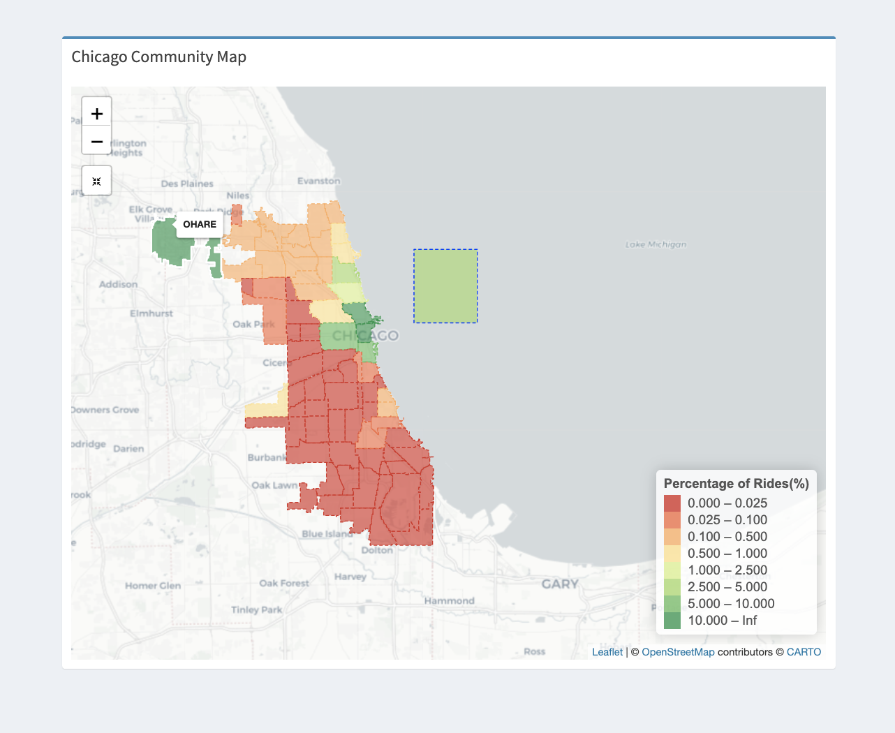
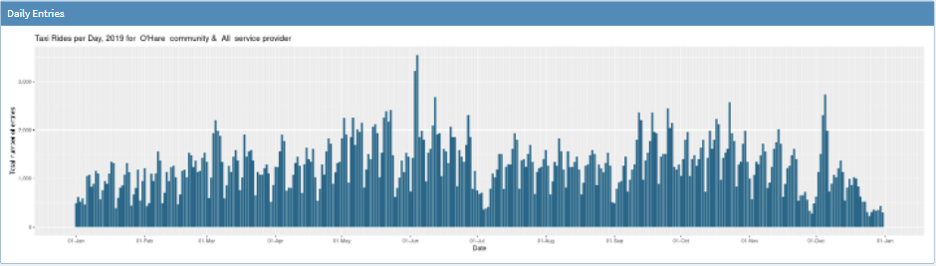
4. On viewing the rides to O’Hare on the map we could see that most of the rides(>10%) to O’Hare were from O’Hare itself, and the loop and its adjoining areas - Near North Side, Near South Side, near West side. It is followed by Lake view and Outside chicago. This means that most people who are in and near the Loop travel often to O’Hare. Since the loop is a major hub and tourist area, it could also explain why there are a lot of rides to O’Hare.
5. Also, since O’Hare is the an international airport, it explains why a larger percentage of people from outside Chicago choose to take taxi rides to it than from most areas inside it.
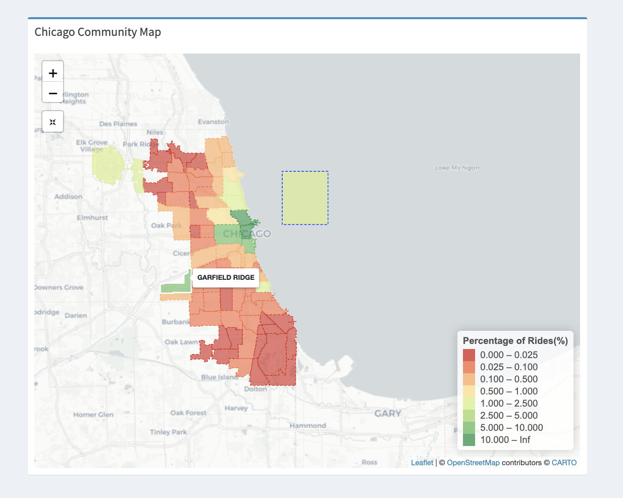
6. Similarly on rides to Garfield Ridge, the rides are centered from the loop, Outside Chicago and surprisingly, O’Hare as shown below. When comparing it with rides to O’Hare we can say that people from outside Chicago prefer O’Hare to Midway comparatively.
7. Ride distance
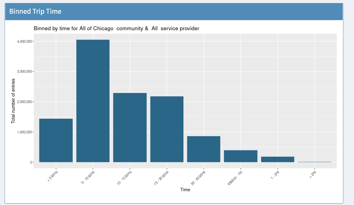
On average, across all communities and taxi service providers, we could observe that most rides are very short, less than 5km.
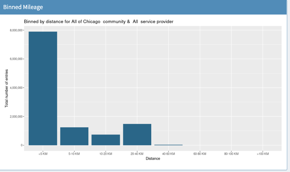
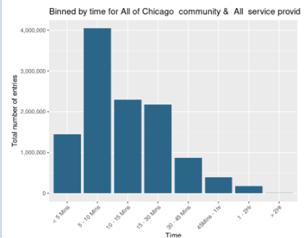
Likewise the time taken for the rides are also very short, in general.
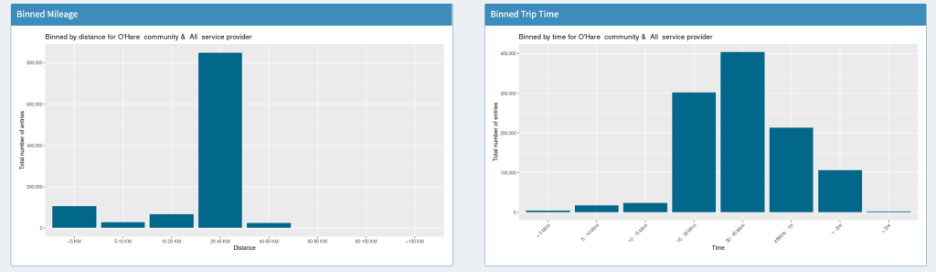
However, if we look at rides to O’Hare, we can see that most ride distances were around 20-40km. This makes sense as the Loop and the adjoining areas are in that bin and it takes around 30-45 mins to travel there
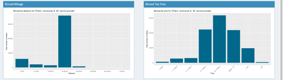
Likewise for rides from O’hare, we see a very similar trend
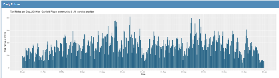
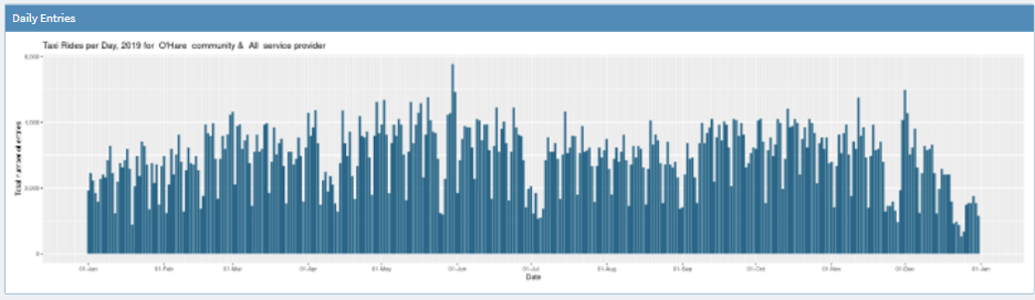
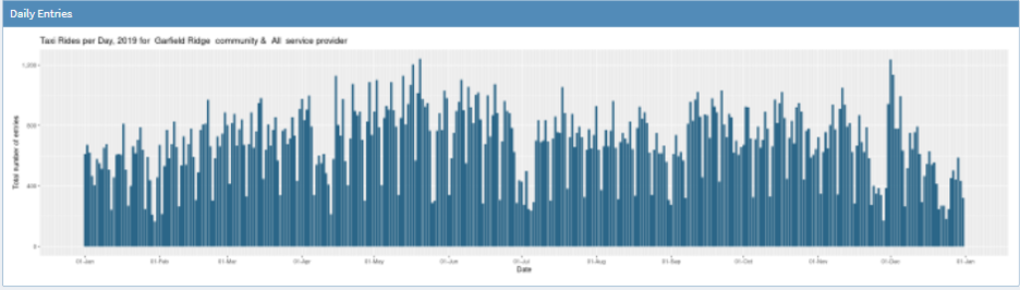
This is supported by the daily graphs as well, if we look at the daily plots from O’Hare and Garfield ridge we see a very similar trend throughout the year. They seem to rise and fall in unison, expect that O’Hare has more number of rides in general.
They both have peaks in May and Dec, from which we could potentially infer that most people travel around holidays.
From O’Hare
From Garfield
To O’Hare
To GreenRidge