CS 424 - Project Page - Sleepy Subway
maintained by
Gautam Kushwah
Important Links
Link to Shiny App for Project 2
Resources
Introduction
The app is written in R and hosted on Shiny apps website. The app helps creates visualisation based on the data provided to it and helps the user get a better understanding of the data and possibly make inferences.
Software version
R version 4.1.2 (2021-11-01) – “Bird Hippie”
RStudio 2021.09.1+372 “Ghost Orchid” Release (8b9ced188245155642d024aa3630363df611088a, 2021-11-08) for macOS Mozilla/5.0 (Macintosh; Intel Mac OS X 12_2_1) AppleWebKit/537.36 (KHTML, like Gecko) QtWebEngine/5.12.10 Chrome/69.0.3497.128 Safari/537.36
What is R?
R is a programming language for statistical computing and graphics supported by the R Core Team and the R Foundation for Statistical Computing
What is Shiny?
Shiny is an R package that makes it easy to build interactive web apps straight from R. You can host standalone apps on a webpage or embed them in R Markdown documents or build dashboards
Purpose of this App
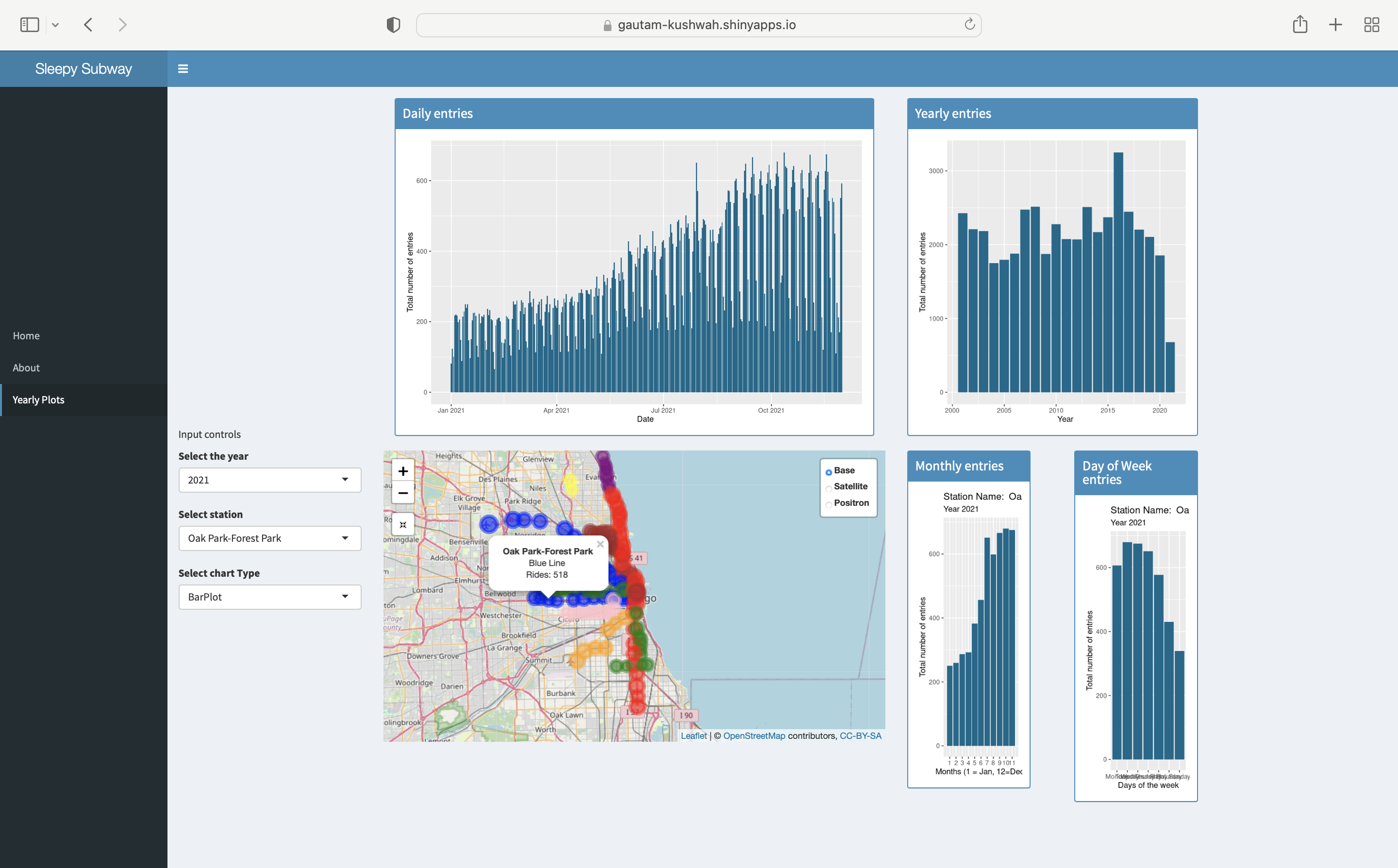
The purpose of this app is to use the data provided on riders on the Chicago L over the past 20 years and use shiny to give people an interactive interface to create those visualizations. The app provides an interactive map with the locations of the stations marked on it with their respective line colors and tapping on the markers gives more information about the line that station serves and and the number of rides on a particular date. The dashboard can also provide the difference in the number of rides between two dates on a particular station.
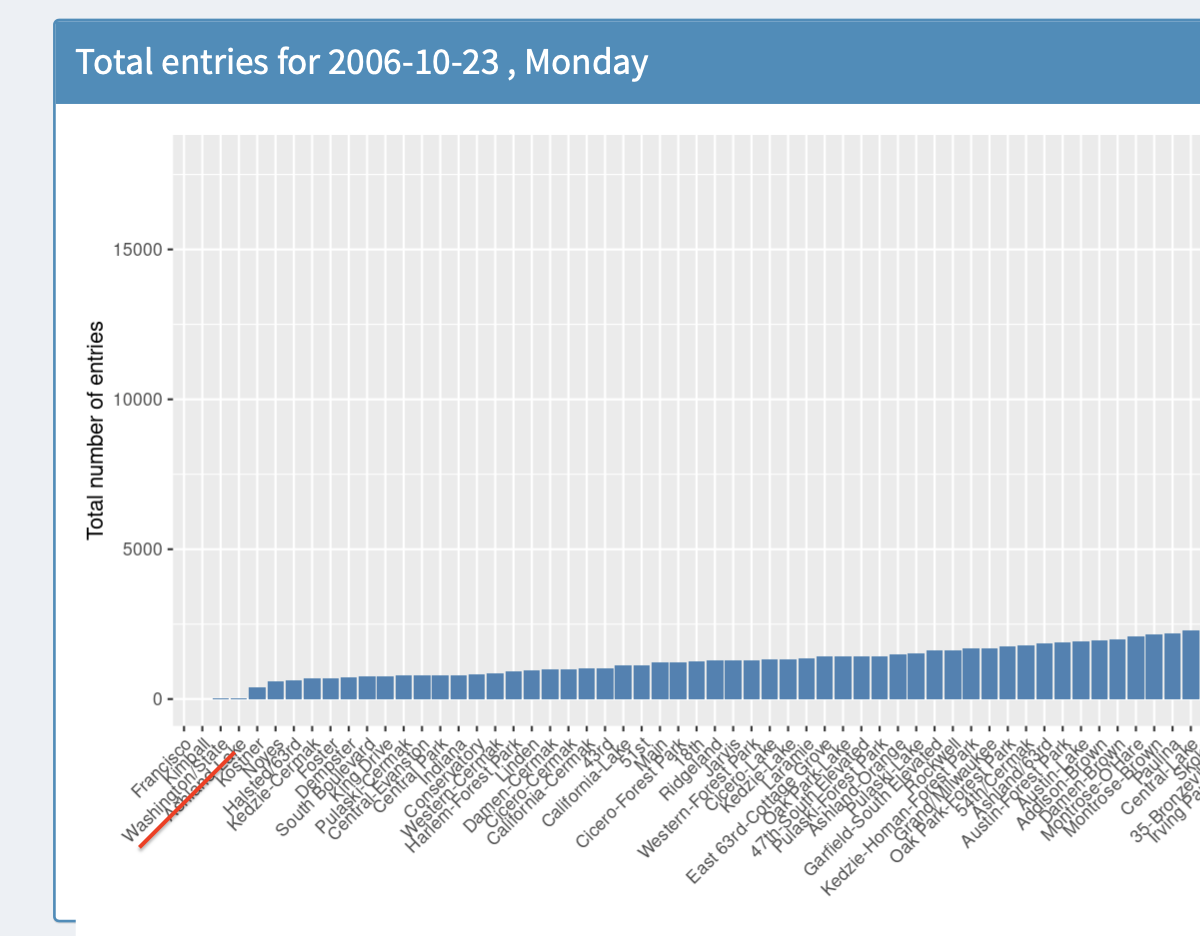
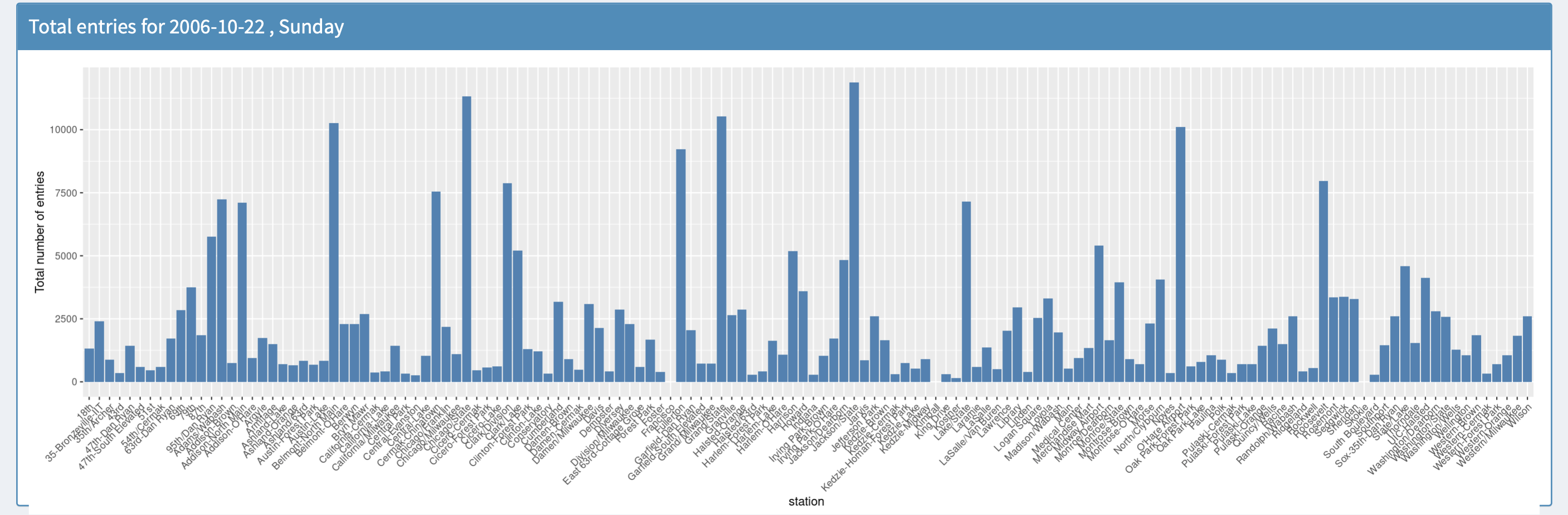
The data is presented on the map, in the form of a bar plot and also in the form of a table with controls for each of them
The app provides various data visualizations in the form of bar graphs breaking down data across all years, individual years, months, and even days in a week over a month.
The app could also help find interesting dates in the last 20 years which might have affected the behavior of the riders and thus help us understand the power of data and data visualization.
How to use the App?
You can head over to the app !here. Upon opening the app, you would be greeted with a Shiny dashboard which would give you a map with locations of the stations marked and a bar plot for the toal number of rides for all the staions on that day.
The app has three sections
- Home Page
- About Page
- Yearly Plots page
These sections could be navigated through using the navigation bar on the left.
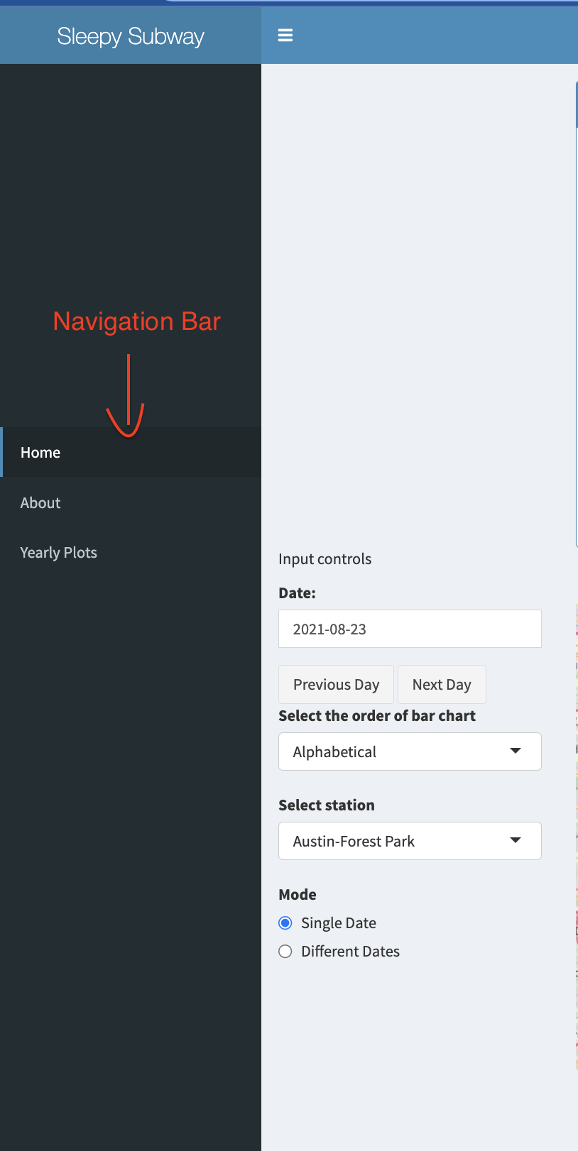
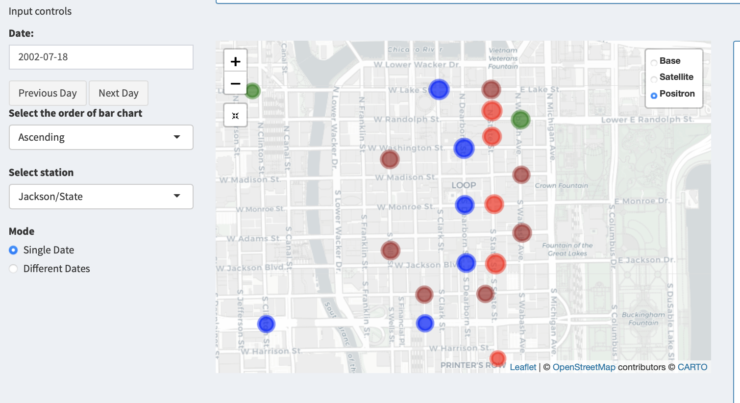
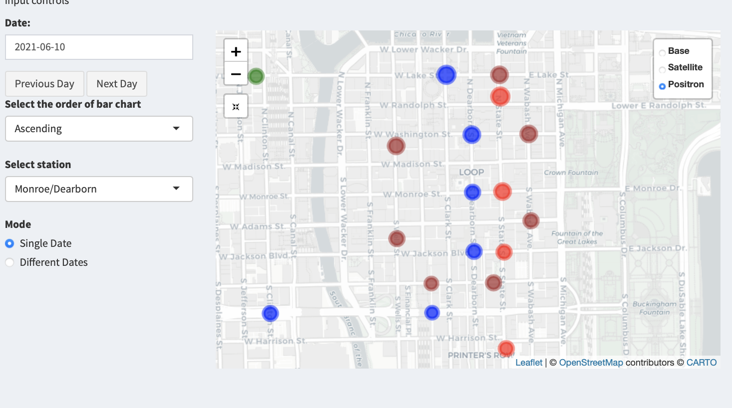
Home Page
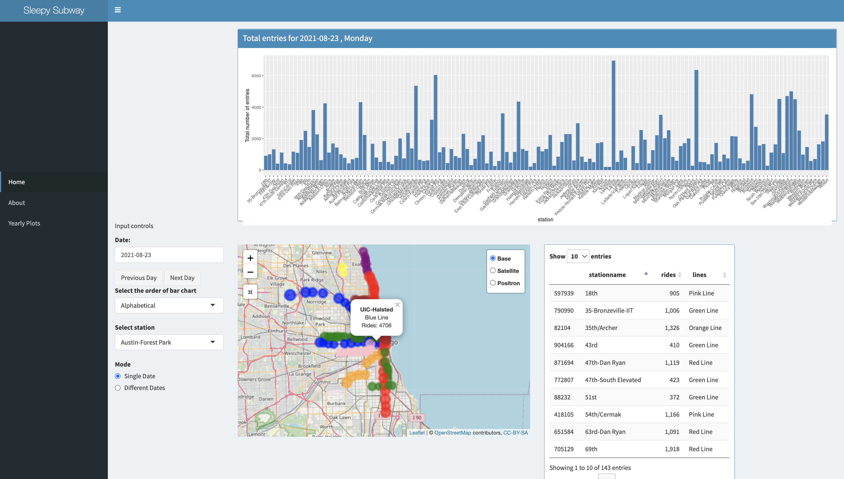
The home page has all the controls for the visualisations shown i.e the map with station locations and their data, a bar plot with total entries for that day for all the stations and a table representing the same data, in a separate section marked input controls.
From here the user can select the date and the visualisations would be updated.
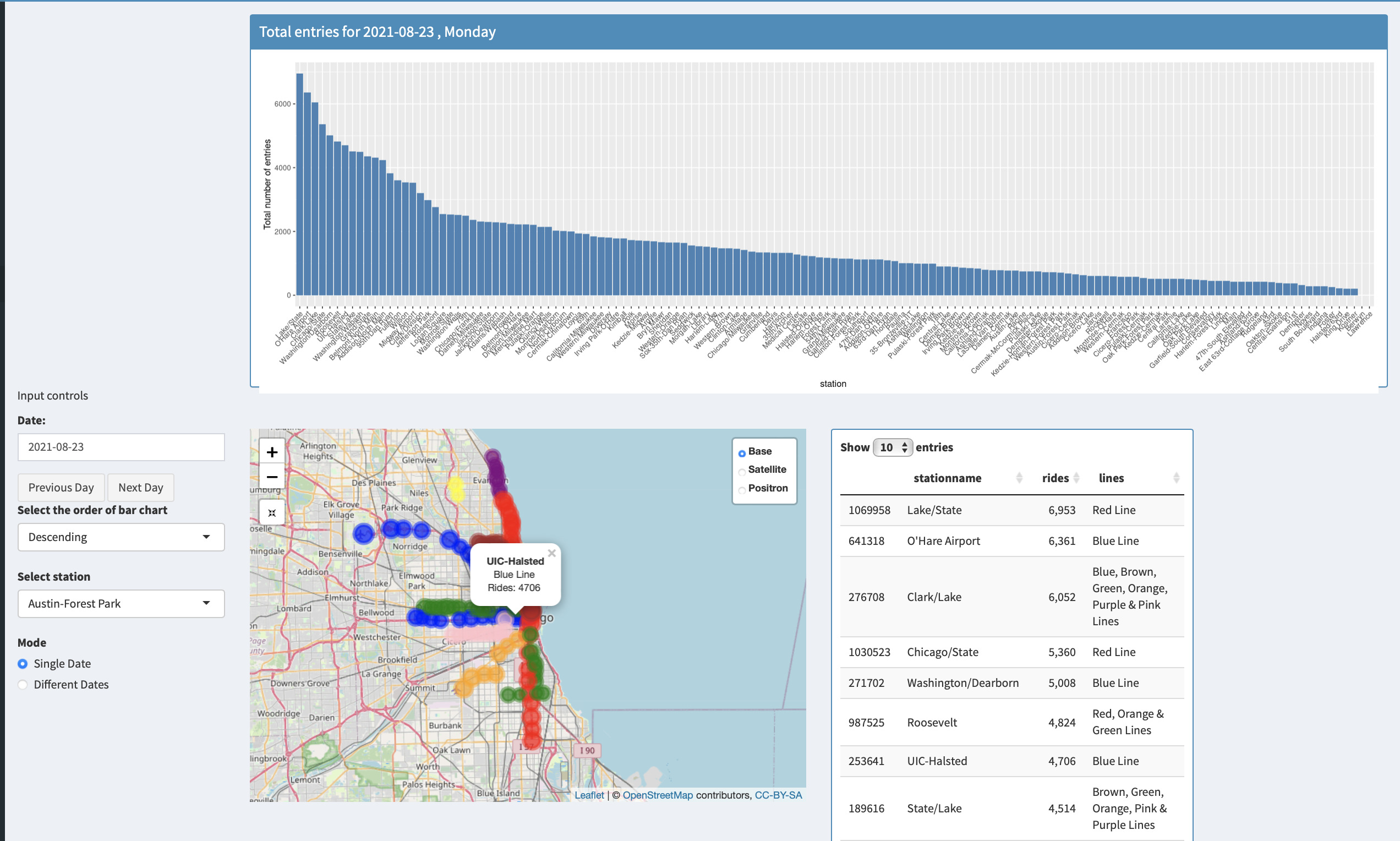
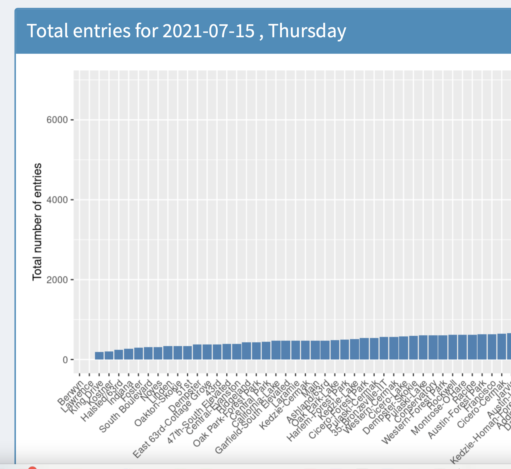
The user can select to order the bar graph and the data table using the “Select the order of the bar chart” dropdown. The three options available are Ascending, Alphabetical and descending.
There are also Prev Day and Next Day button to quickly see data for the previous day and the next day respectively.
The app has two modes of visualisation
- Single Date
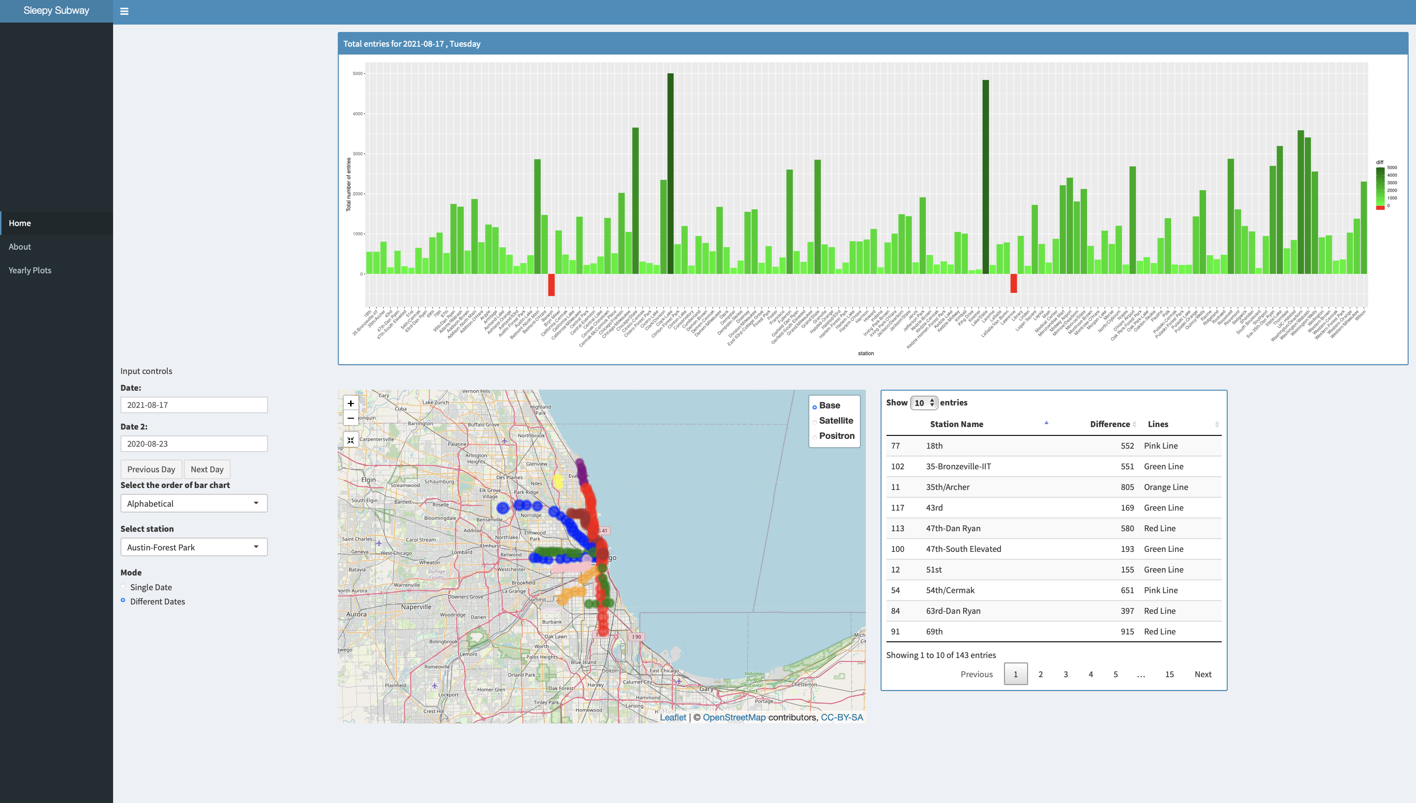
- Different Dates
The different dates mode enables the user to select two different dates and then uses the difference between the ridership information on those two dates to make all the visualsation. All other controls work as before.
Different dates mode
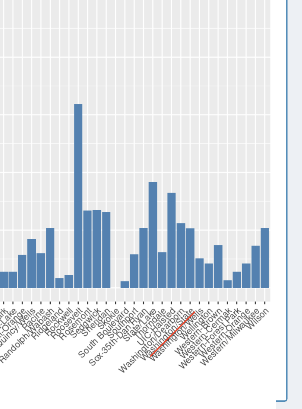
Bar chart sorted in a descending manner
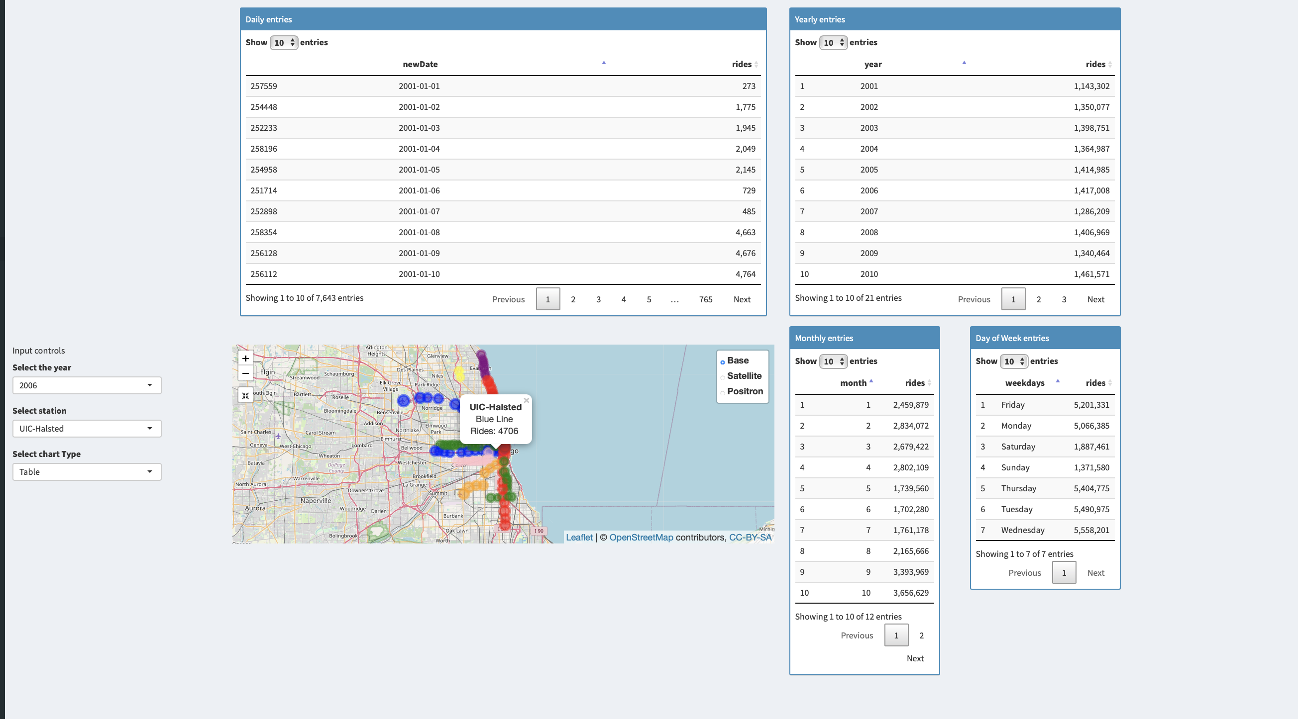
Yearly Plots Page
The yearly data visualizations in the form of bar graphs breaking down data across all years, individual years, months, and even days in a week over a month for a particular station.
The user can select the station from the list of all the stations on the left or from tapping a station on the mao. The user can also select the year for which they want to see thr visualisations.
The user can also select whether they want to see the visualisations in the form of bar plots or in the form of tables.
Data tables instead of bar charts
About the Data
The data was obtained from Chicago Data portal, the link to the data could be found here
This list shows daily totals of ridership, by station entry, for each ‘L’ station dating back to 2001. Dataset shows entries at all turnstiles, combined, for each station.
The data consists of 5 columns and about 1.09 million rows.
The columns are as follows station_id - Unique ID for a station
stationname - The name of the station
date - The date of the entries
daytype - W=Weekday, A=Saturday, U=Sunday/Holiday
rides - total number of ridership on that date
The other files which contained the latitude and longitude of the stations was also taken from Chicago data portal which could be found here
The columns are as follows
STOP_ID
DIRECTION_ ID Normal Direction of train taffic at the platform
STOP_NAME
STATION_NAME
STATION_DESCRIPTIVE_NAME - A more fully descriptive name of a station.
MAP_ID
ADA - Boolean (if the station is ada compliant)
RED - Boolean (if the station serves red line)
BLUE - Boolean (if the station serves blue line)
G - Boolean (if the station serves green line)
BRN - Boolean (if the station serves brown line)
P - Boolean (if the station serves purple line)
Pexp - Boolean (if the station serves Purple Express line)
Y - Boolean (if the station serves Yellow line)
Pnk - Boolean (if the station serves Pink line)
O - Boolean (if the station serves Orange line)
Location - The latitude and longitude values
R Libraries required to process the data
library(shiny)
library(lubridate)
library(ggplot2)
library(shinydashboard)
library(dplyr)
library(stringr)
library(leaflet)
library(leaflet.providers)
library(leaflet.extras)
library(DT)
library(shinyjs)
library(tidyverse)
library(reshape2)
The date was provided in a chr format, therefore it had to be converted into a usable format which was achieved through a R library called lubridate
The data was downloaded in tsv format, since the free version of Shiny allows us to only work with files which are <5 mb, I used shell script to break it down into smaller files using shell and the following command
split -b <size in kb> <filename> <name of parts>
The
I then used a code editor to verify if the files were broken down correctly, and upon verifying that I loaded the filenames in a list in R and then stitched them together into a single table, hence being able to work with all the rows, using the code below
#read all file names in a temp variable
temp = list.files(pattern="parta..tsv")
allData2 <- lapply(temp, read.delim)
allData <- do.call(rbind, allData2)
I then extracted the the info on the lines the stop serves from STATION_DESCRIPTIVE_NAME and created a new column and then merged the ridership data table with the stop info table
lat_long <- read.table(file = "CTA_-_System_Information_-_List_of__L__Stops.tsv", sep = "\t", header = TRUE, quote = "\"")
lat_long$lines <- str_extract(lat_long$STATION_DESCRIPTIVE_NAME, "\\(.*\\)")
lat_long$lines <- str_remove_all(lat_long$lines, "[\\(\\)]")
lat_long <- lat_long %>% distinct(MAP_ID, lines, .keep_all = TRUE)
mergedData <- merge(x = allData, y= lat_long, by.x = c("station_id"), by.y = c("MAP_ID"), all.x = TRUE)
Next step was mapping the data onto the map for which I used the library Leaflet
The basic syntax is below and a more detailed one could be viewed on the github repo the link for which has been provided above
map <- leaflet(options= leafletOptions()) %>%
      addTiles(group="Base") %>%
      addCircleMarkers(data = df, lat = ~lat, lng = ~long, )
The code for plotting various tables and bar graphs could also be found there
Github
The github repo for the source code could be found below Github Repo CS424
The source code is the file called app.R, with all the broken uptsv files named from partaa.tsv to partah.tsv and also the location data file.
To run the code you would need to download and install R and R-Studio the links to which could be found !here and here respectively
Either clone or download the zip file from the repo and unzip it on your machine in your preferred location. Now to run the app follow these steps:
1 Open R-studio
2 Click on File->New Project
3 Choose existing directory from the pop-up window
4 Now select the directory where you have downloaded the project
5 Follow the on screen instruction
Once the project has been created/opened go to app.R from the navigation tab on the bottom right of the IDE Then in the file editor window on the top left, you would find a run app button, alternatively you could also use the R console and type in the command “runApp()”
The app would be launched in a separate window.
You could also open it in your web-browser by clicking on “open in web browser” button in the app window
To refer to the instructions on how to use and interact with app, please read the How to Use the App section above
Observation and Inferences
1 Addition of more stations to yellow line
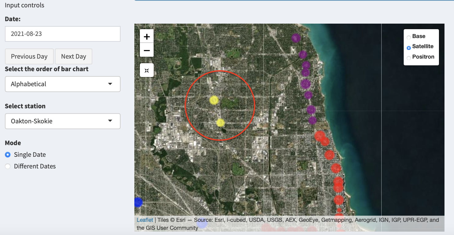
Using these images from the map it is clear that a new station was added to the yellow line
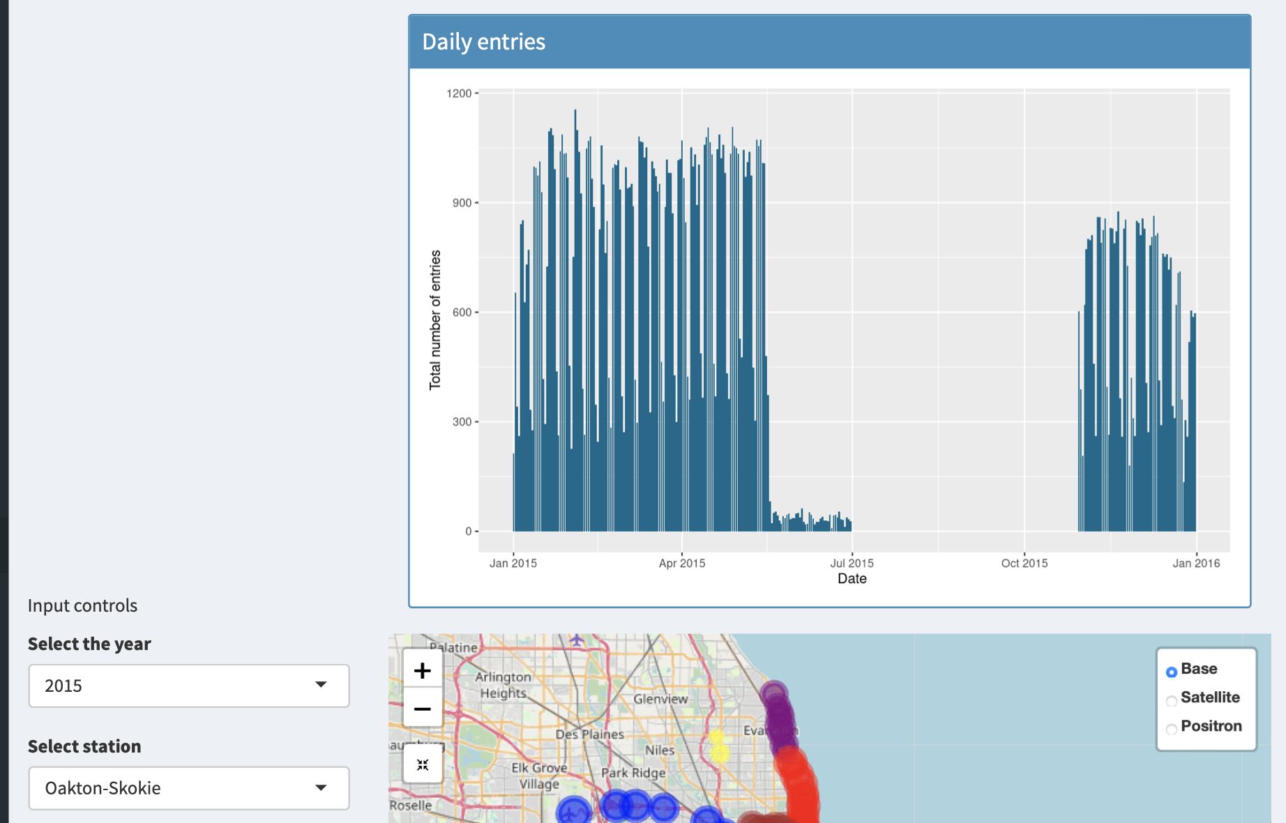
Furthermore, we can inspect that there is a huge gap in ridership entries in the year 2015 for Oakton/Skokie A quick internet search reveals that there was a dam collapse near the railways lines leading to closure of the station
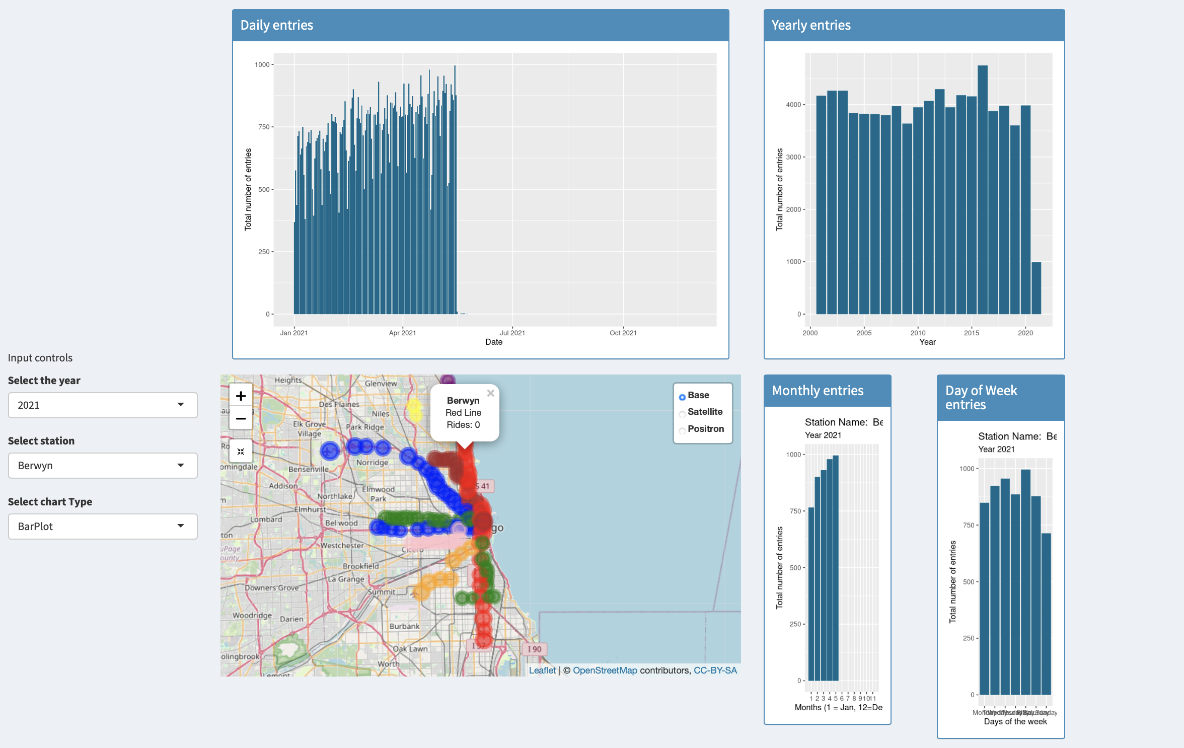
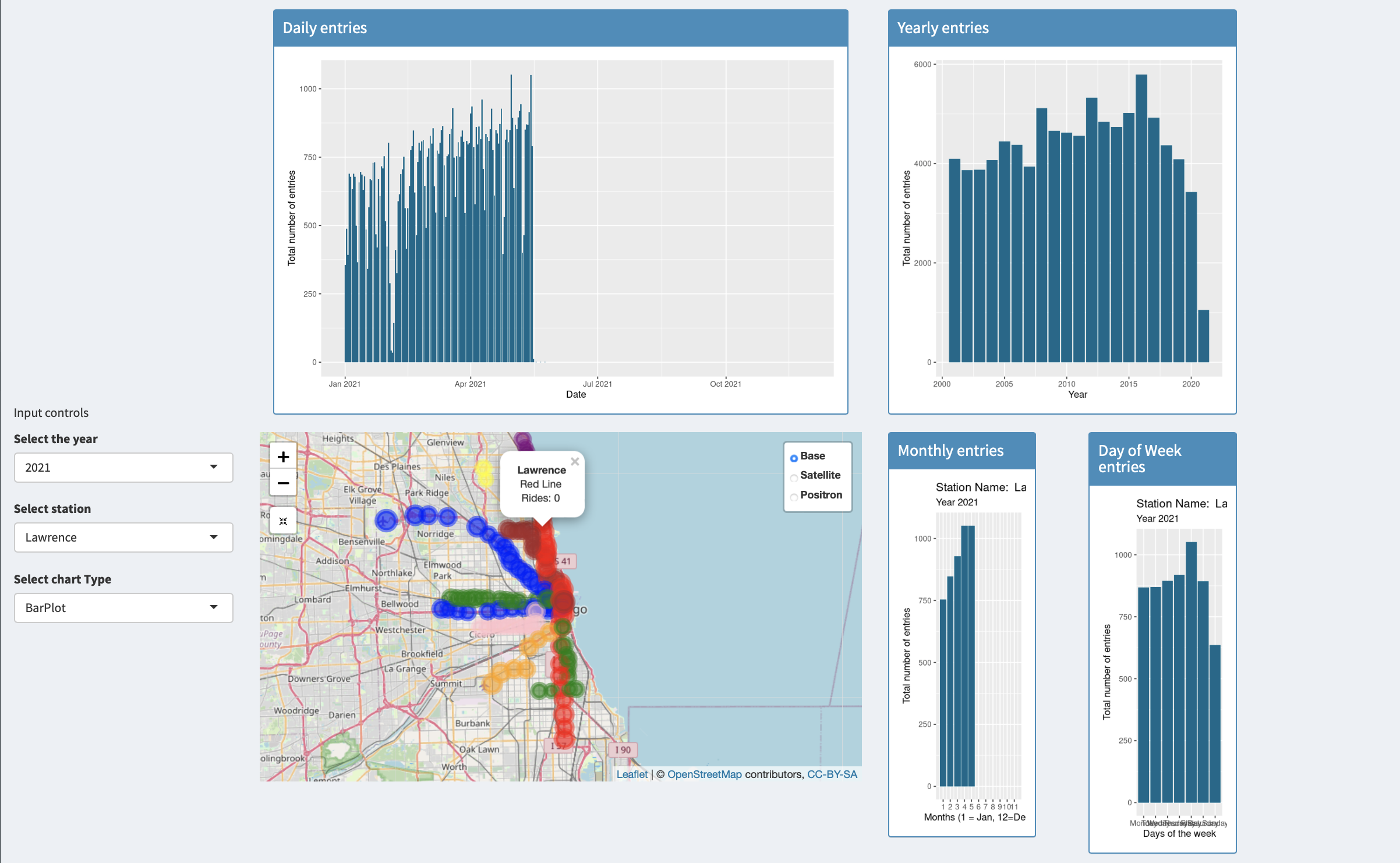
2 Berwyn and Lawrence closed
Berwyn and lawrence stations show no ridership information for the above date, on searching the internet it becomes clear that these stations are temporarily closed
Ridership info for Berwyn
Ridership info for lawrence
3 Washington abandoned on the red line
Washington was abandoned on the red line
the following ridership information on October 24th shows no entries for washington
The last day wshington has any ridership information
A zoomed in view
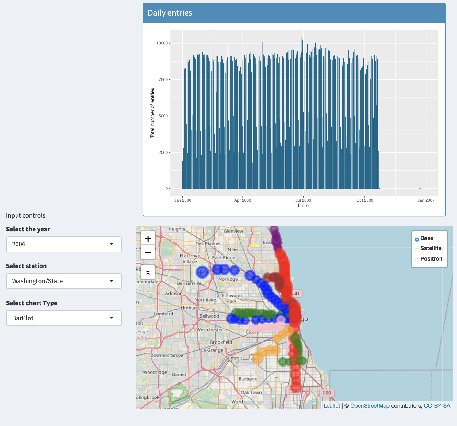
Daily entries for Washington for the year 2006
On the wikipedia page it says that the station was closed as a development of a superstaion is planned